Client case study · Launched on nanobytepay.com
Nanobyte
Paying with crypto should feel as ordinary as any other way to pay. The website had to make that case before anyone installed a thing.
- Client
- Nanobyte Payments B.V.
- Role
- UX/UI Designer, on a team of designers
- Timeline
- 2023
- Platform
- Marketing website, light and dark
At a glance
The problem, the key calls, and where it landed.
- The problem
- Nanobyte is a Chrome extension wallet for Nano, a fee-free cryptocurrency, with one-click checkout and tipping on Twitter and Reddit. Its original site said little about how any of that worked: one Download button, a short feature list, and an FAQ. There was nothing about tipping, which the community loved, and nothing for the merchants the business needed.
- Team
- A team of UX/UI designers on an Avocademy client project, working with Nanobyte's founders. I worked across research, user flows, color exploration, wireframes, light and dark high-fidelity UI, the style guide, and the developer handoff.
Key decisions
Result
Nanobyte launched the new nanobytepay.com in July 2023, built on this structure and content.
Where it started
A wallet that worked, behind a site that didn't explain it.
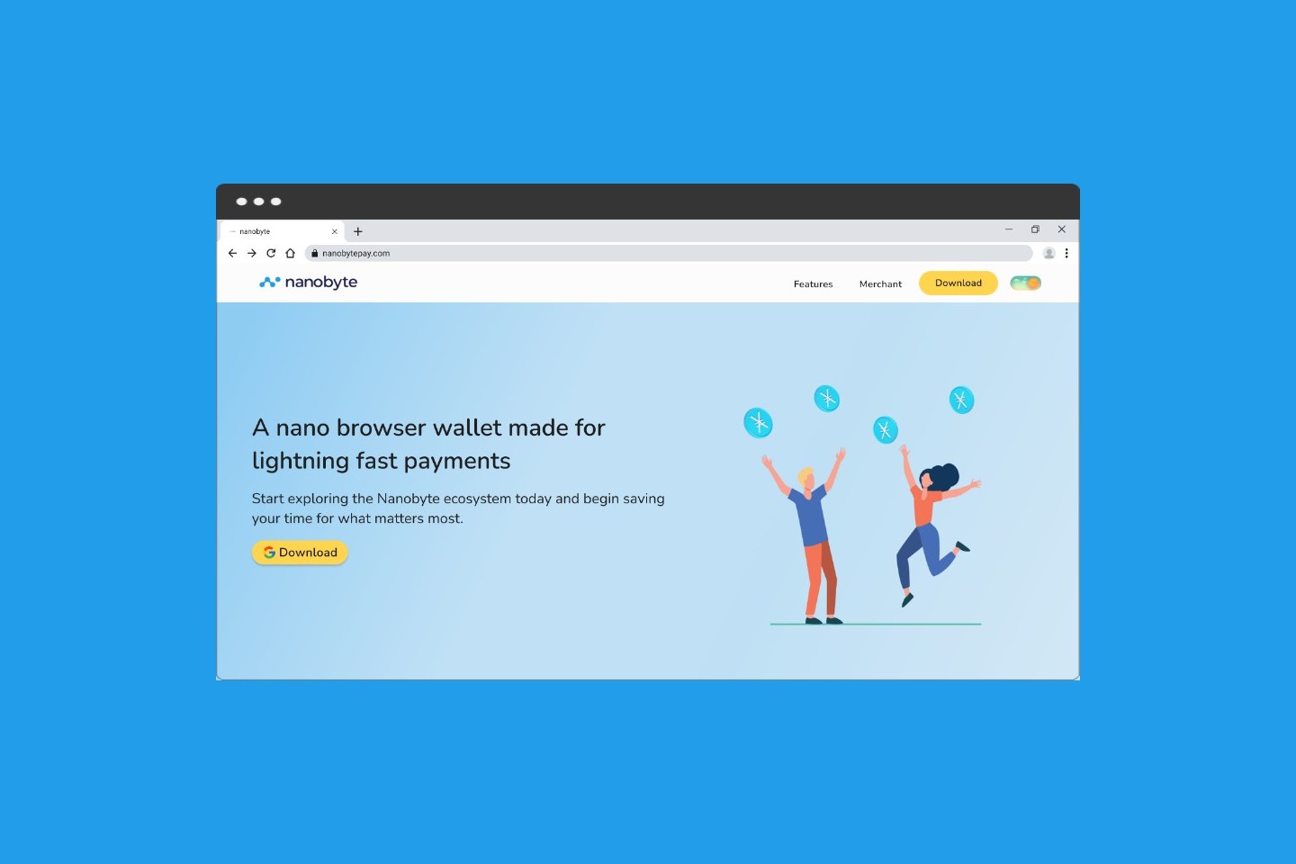
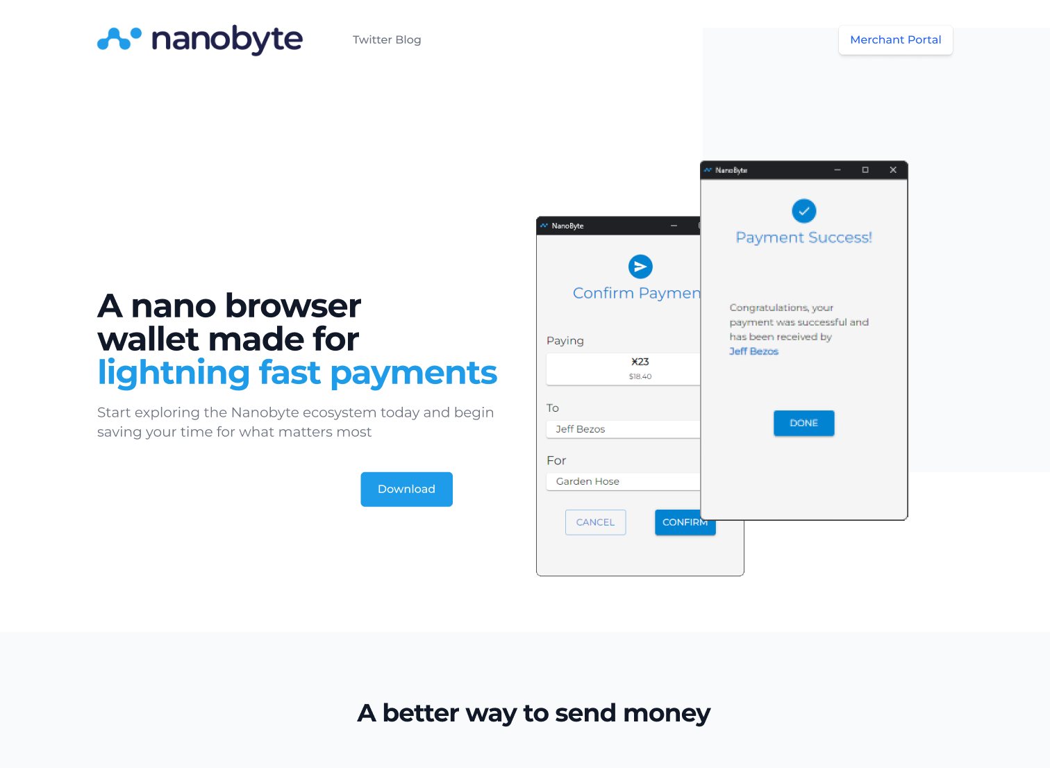
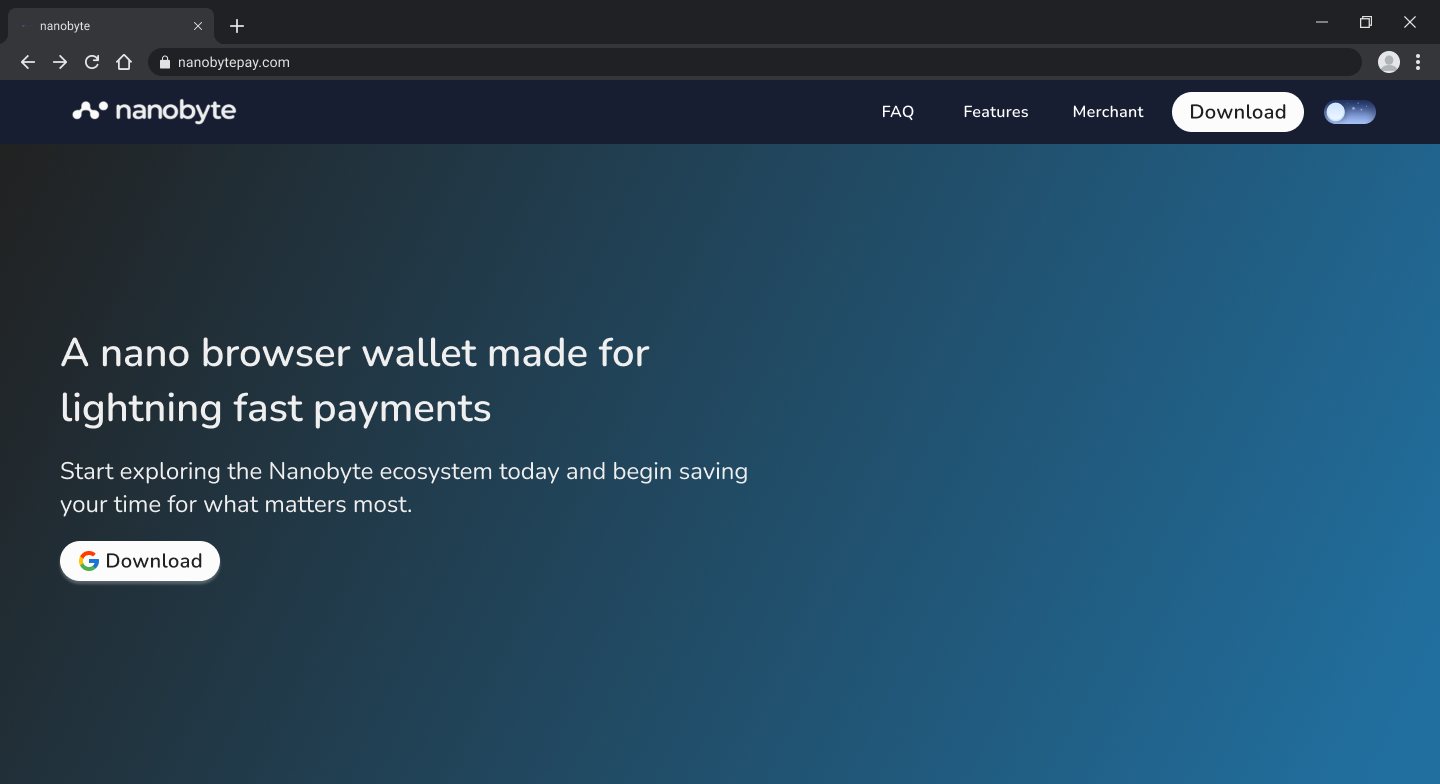
The original nanobytepay.com opened on a strong line, “A nano browser wallet made for lightning fast payments,” next to screenshots of a desktop payment dialog. Below that came three short features and an FAQ. Download appeared once, in the hero.
The founders' brief named two gaps. Tipping on Twitter, and soon Reddit, was what excited the Nano community most, and the site barely mentioned it. And merchants who wanted to accept Nanobyte had a Merchant Portal button with no explanation of how to integrate. They wanted the new site to feel simple, sleek, and intuitive.
Research
Learning from the wallets and payment brands people already trust.
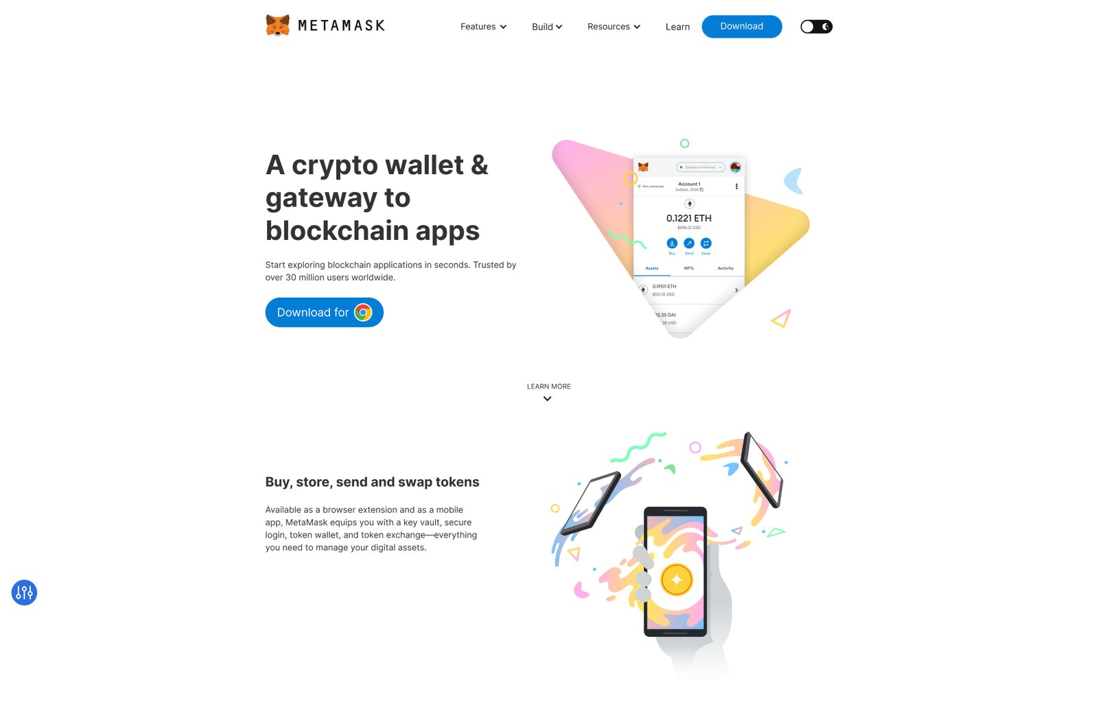
We studied how MetaMask, the best-known crypto wallet, introduces its browser extension, and how mainstream payment brands like Stripe, Klarna, and PayPal make money feel approachable: plain language, confident color, and illustrations of people rather than coins.
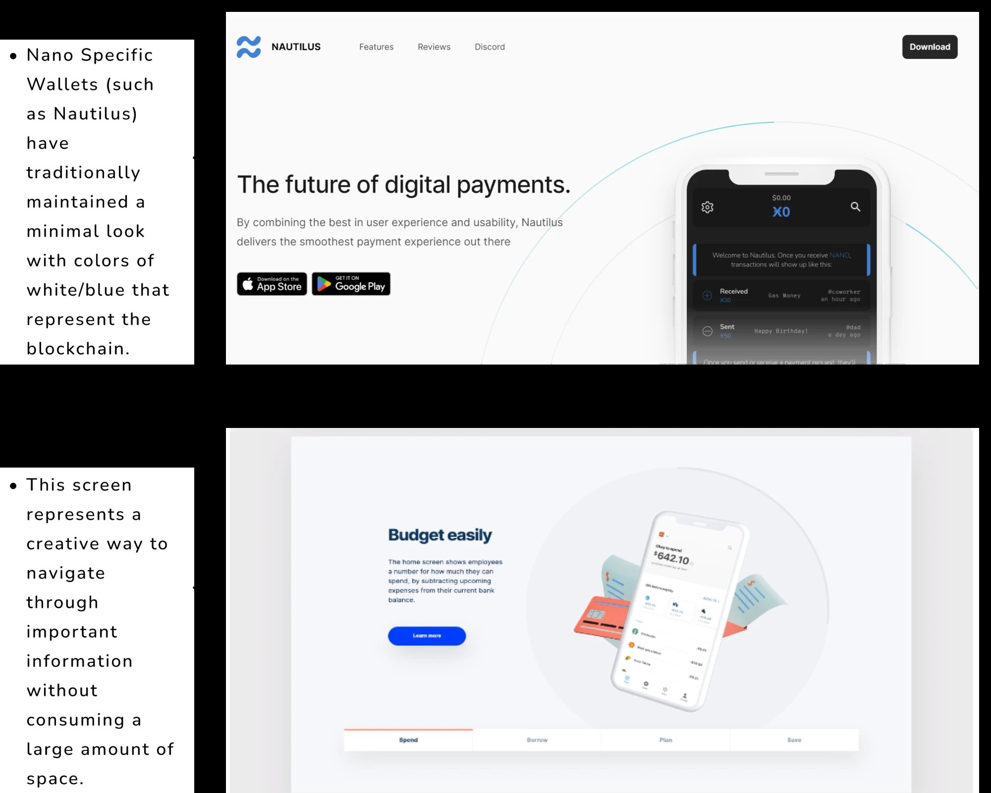
Closer to home, Nano-specific wallets such as Nautilus have kept a minimal look in white and blue, colors that have come to represent the blockchain. Outside crypto, a budgeting site's tabbed feature panel showed a creative way to move through important information without taking up a large amount of space, the pattern that later shaped our How It Works section.
That set the direction. Nanobyte would present itself as a better way to pay, not as a crypto product, and would explain security and privacy up front instead of burying them in the FAQ.
User stories and flows
Three stories, and one finding that changed the navigation.
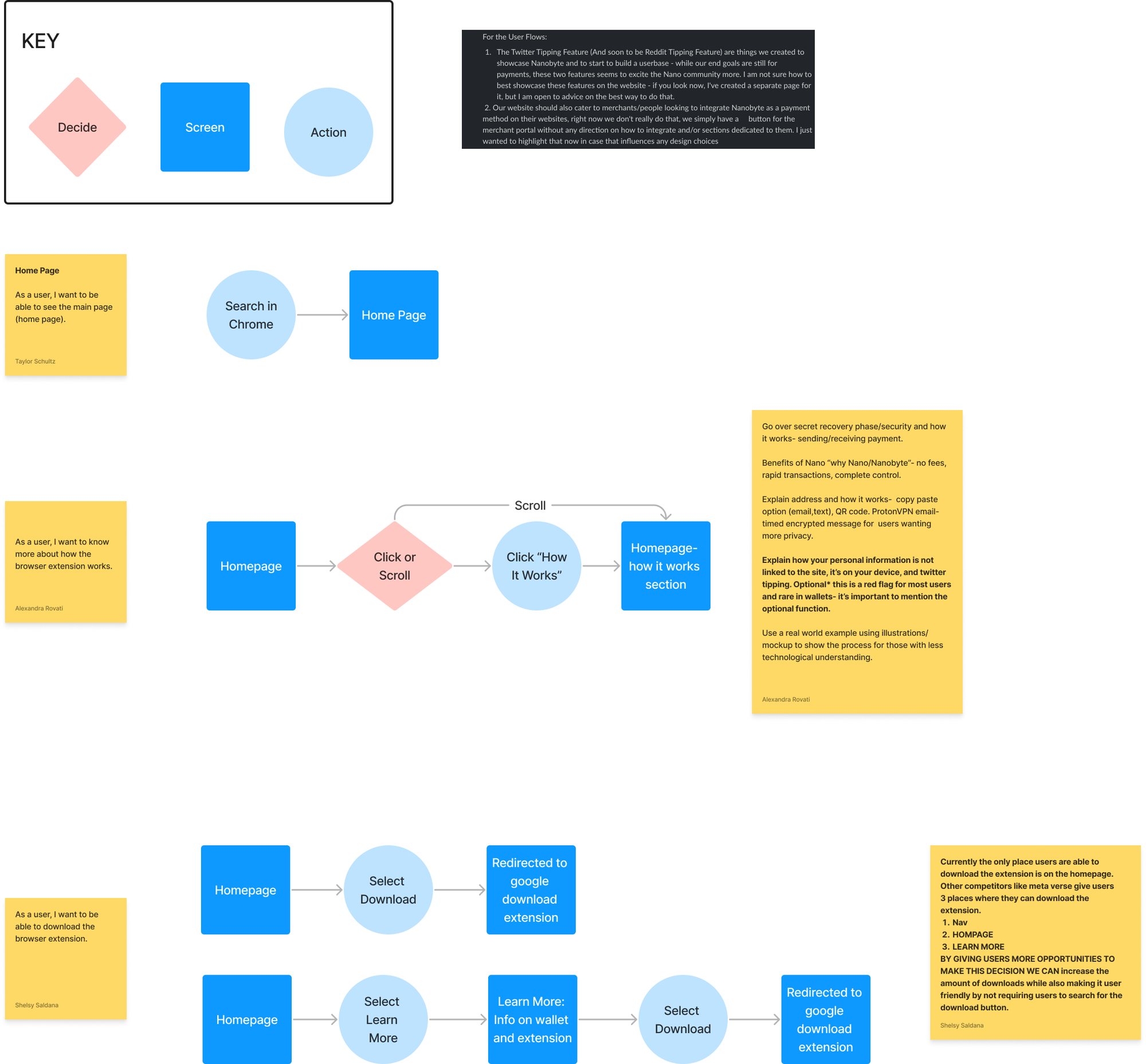
We wrote user stories and mapped each one: reaching the homepage, learning how the extension works, and downloading it. The download flow surfaced the biggest problem. The only place to get the extension was the homepage hero, while competing wallets offer three: the navigation, the homepage, and a Learn More page. More chances to decide, without having to search for the button, means more downloads.
The How It Works flow came with a content list: the secret recovery phrase and security, why Nano (no fees, fast transactions, full control), how wallet addresses work, and that personal information stays on your device. We flagged that Twitter tipping must be clearly optional, because a wallet that asks to link your social accounts is a red flag for most crypto users.
Wireframes
One page, a sticky nav, and crypto crossed out.
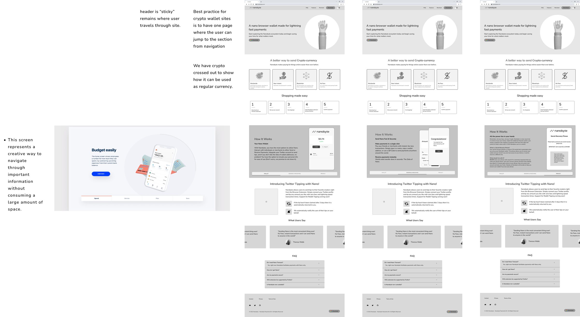
The wireframes settled the structure before any color went in. We tested three versions of the How It Works panel side by side.
One page, sticky nav
Crypto wallet sites work best as a single page where the navigation jumps to each section. The header stays pinned as you scroll, so FAQ, Features, Merchant, and Download are always one click away.
Crypto, crossed out
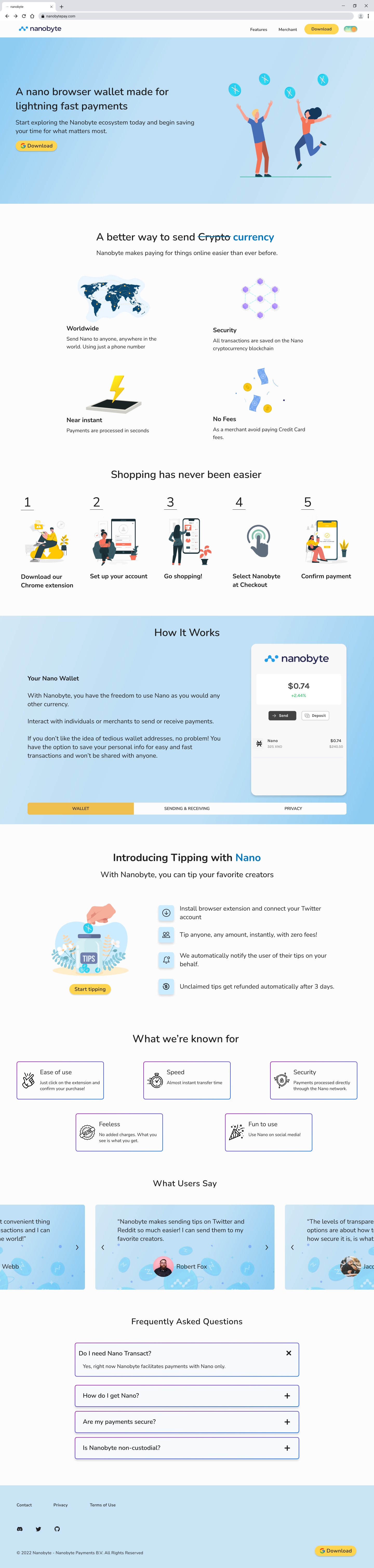
“A better way to send Crypto currency,” with “Crypto” struck through. One headline that reframes Nano as everyday money, followed by a five-step “Shopping made easy” strip.
How It Works in three tabs
Wallet, Sending & Receiving, and Privacy share one panel. Borrowed from the tabbed panel in our research, tabs carry a lot of important information without taking up three long sections of the page.
Color and visual direction
Keeping the brand's blue, and giving it room to breathe.
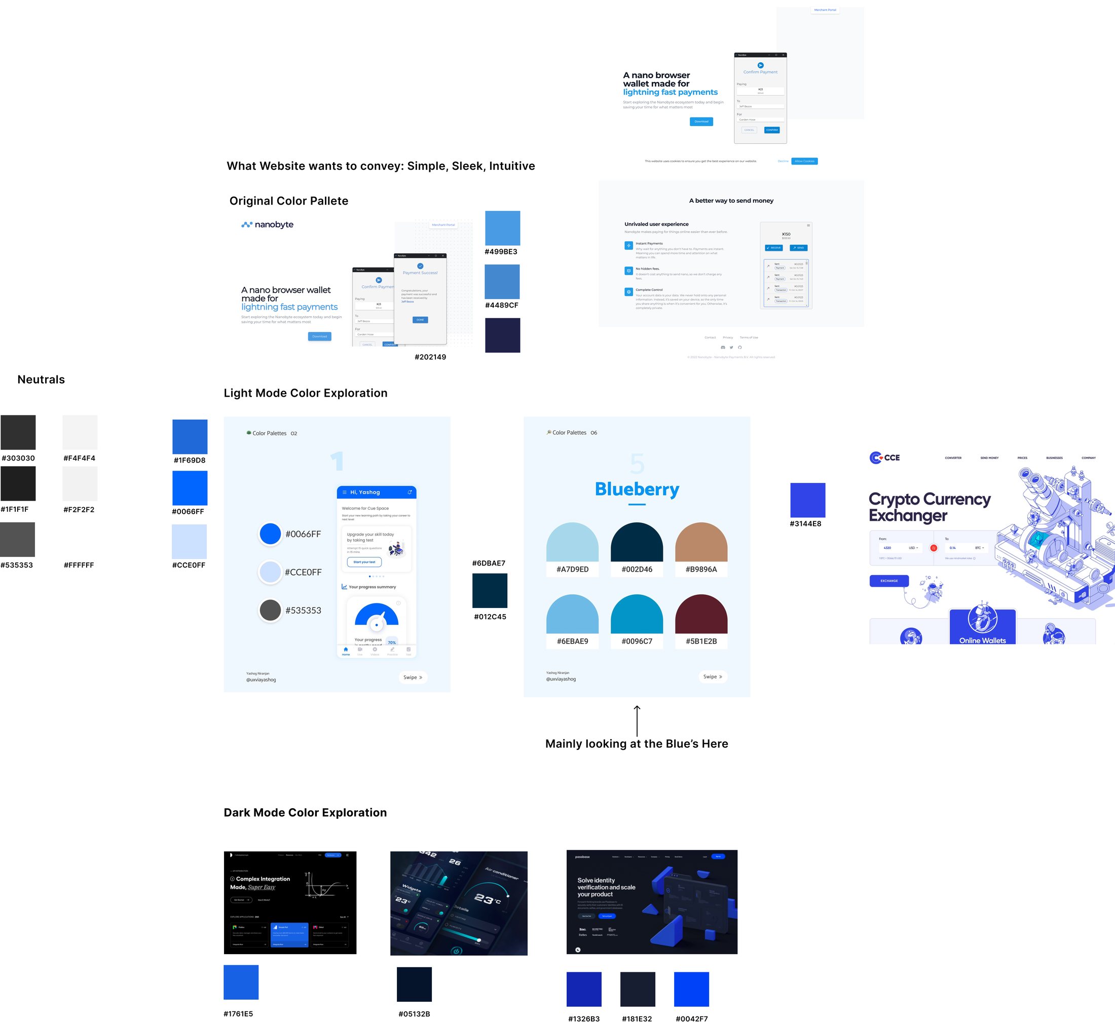
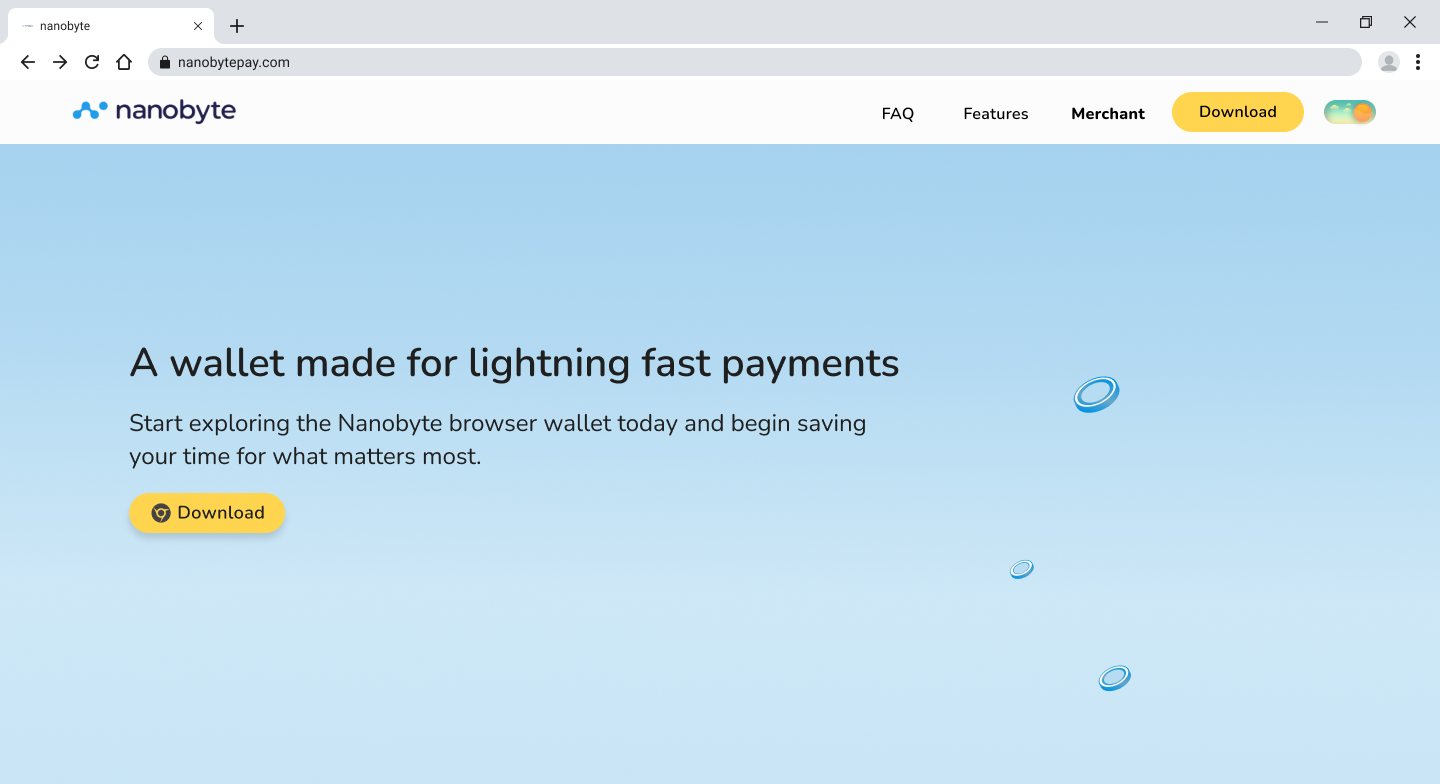
We started from the original palette (#499BE3, #4489CF, #202149) and explored light and dark directions around it. The goal was to keep Nanobyte recognizably blue while making it feel lighter and friendlier than a typical crypto site.
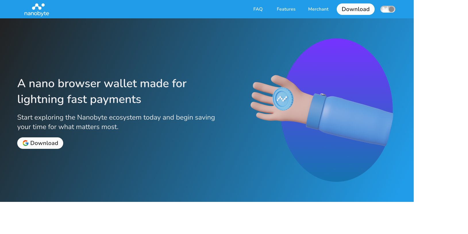
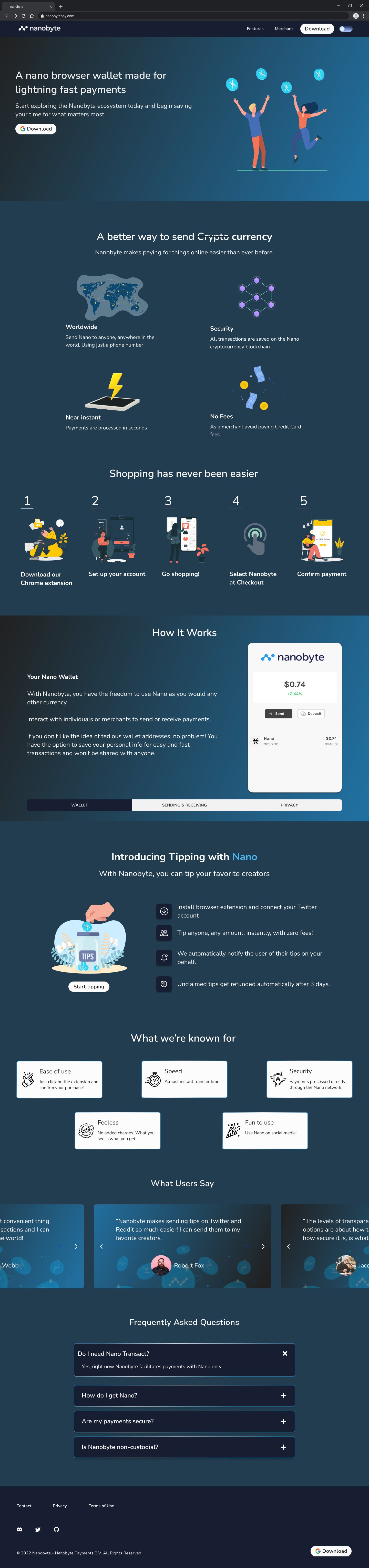
Early dark iterations used a 3D hand holding a coin. The final direction moved to illustrations of people celebrating, a soft blue gradient in light mode, deep navy in dark mode, and one yellow call to action that stands out in both.
Style guide
Nunito, a 12-column grid, and components in both themes.
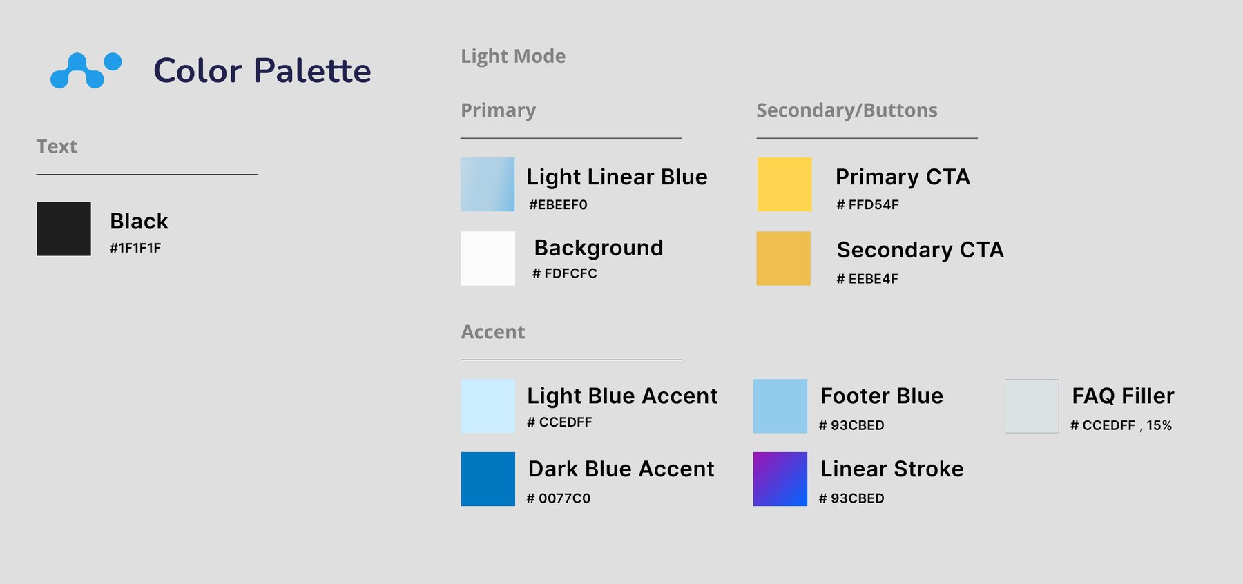
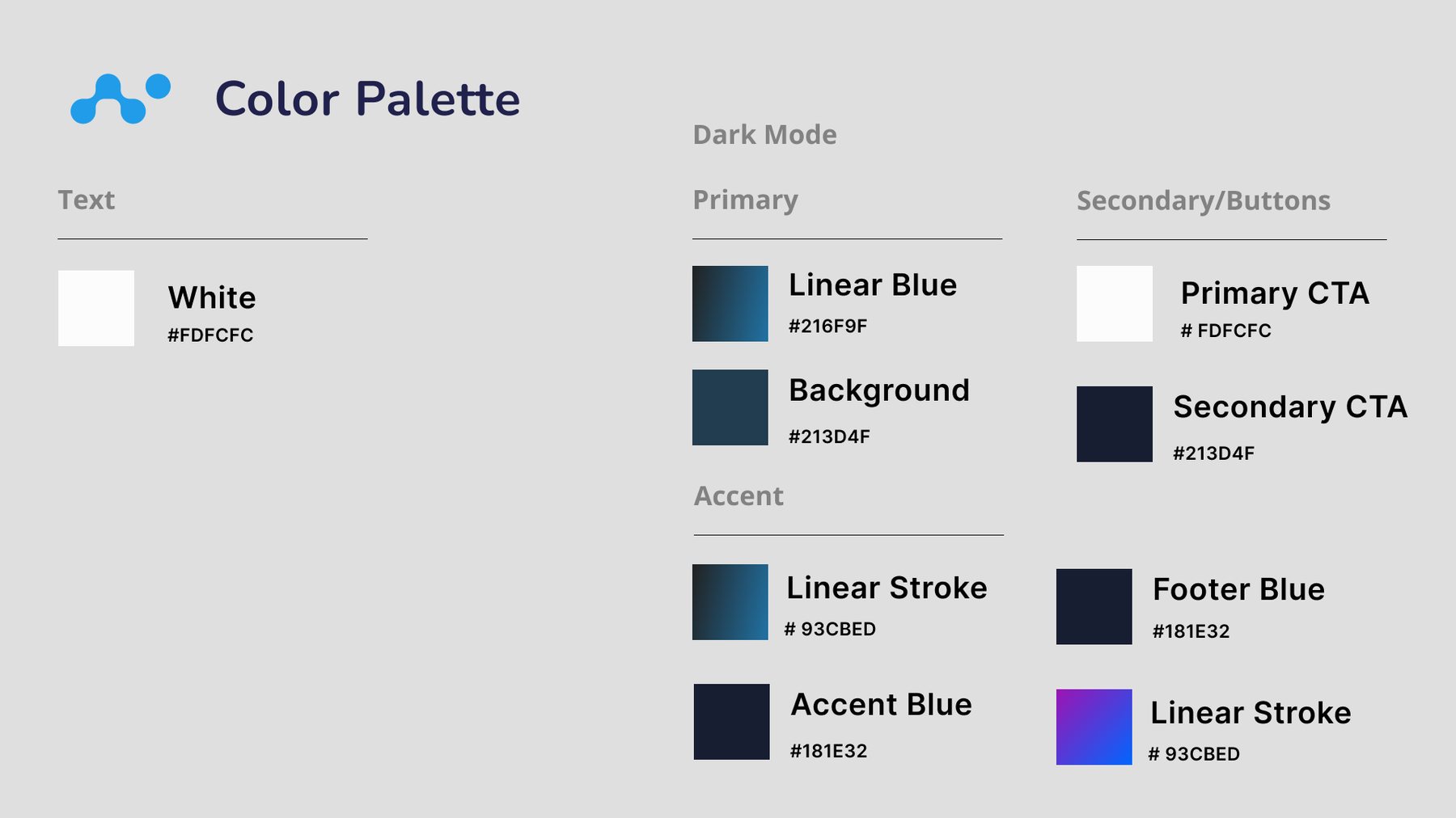
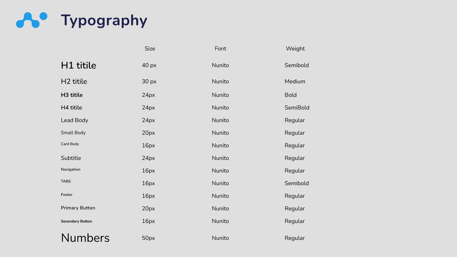
Both themes are built from the same color roles: text, primary, background, secondary and button colors, and accents. Switching themes swaps the values, not the structure. Type is Nunito throughout, from a 40px H1 down to 16px navigation and buttons, with a 50px style for numbers.
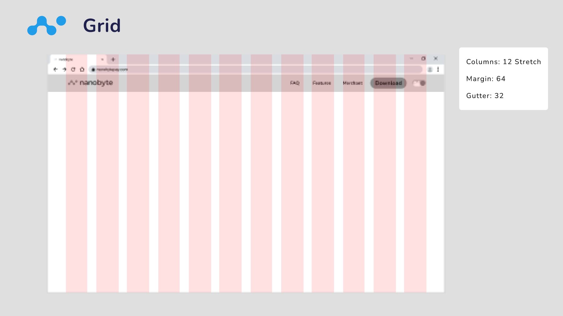
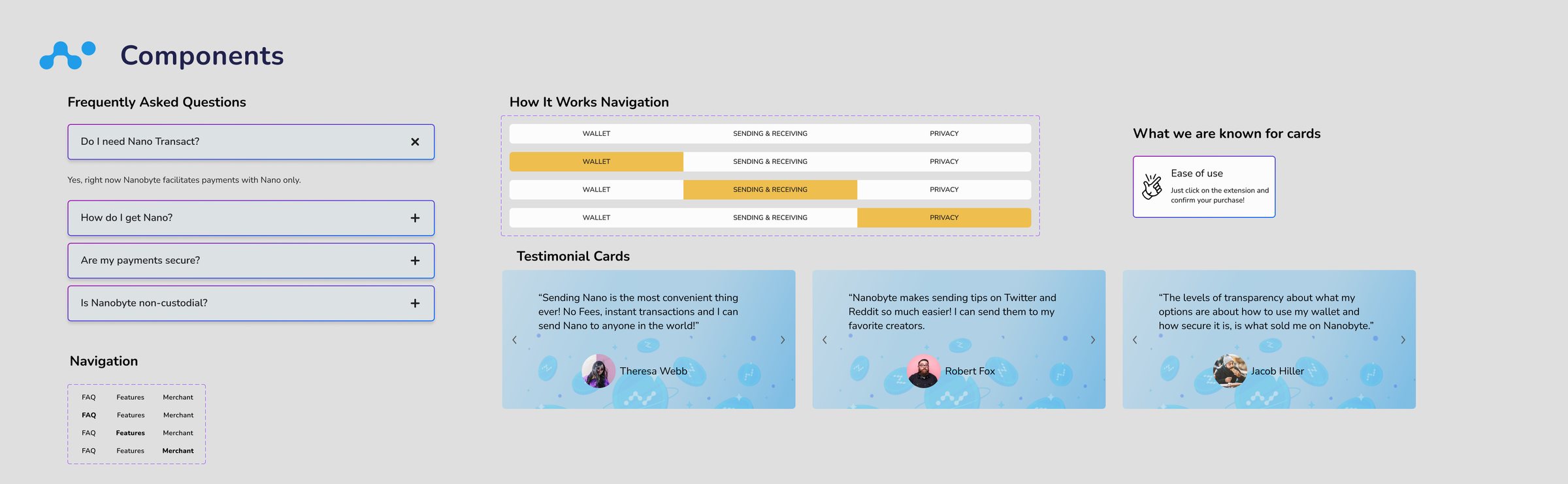
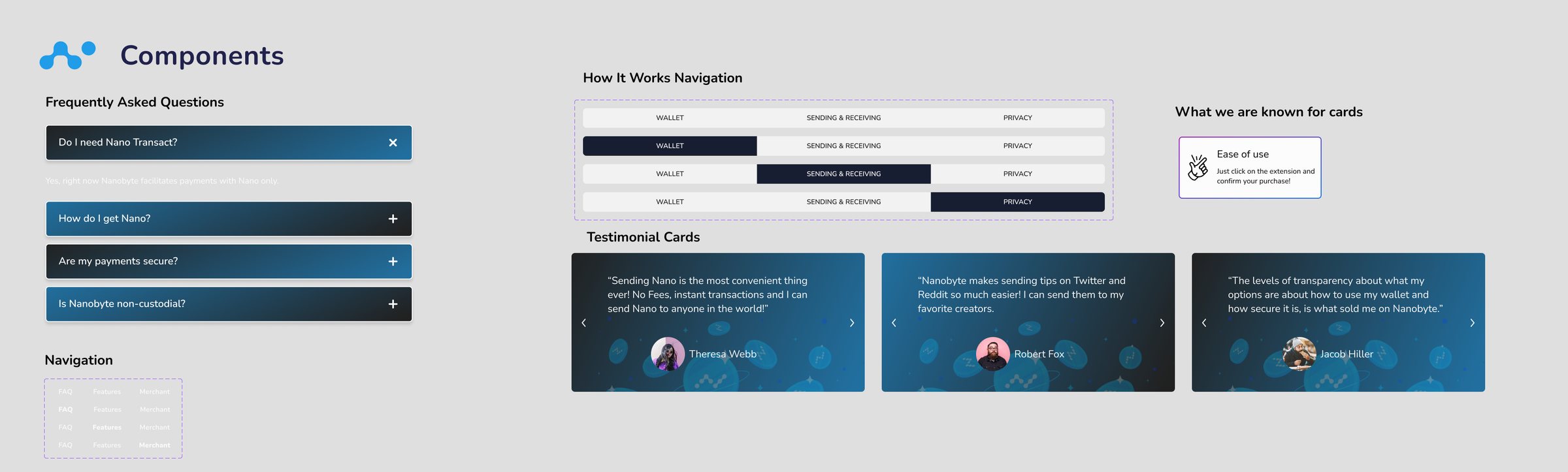
The layout uses a 12-column grid with 64px margins and 32px gutters. Components (the FAQ accordion, How It Works tabs, testimonial cards, feature cards, and navigation) are documented in light and dark, alongside the illustration set.
High fidelity, light and dark
The whole page in both themes, with a toggle in the nav.
The final page follows the wireframe's order and adds the tipping story the community wanted. “Introducing Tipping with Nano” explains it in four steps: connect Twitter, tip any amount instantly with zero fees, Nanobyte notifies the person you tipped, and unclaimed tips come back after three days.
Below that are five “What we're known for” cards, testimonials, and the FAQ. A switch in the navigation flips the theme. Scroll each page below to see it in full.
Developer handoff
Specs and intent, annotated for the build.
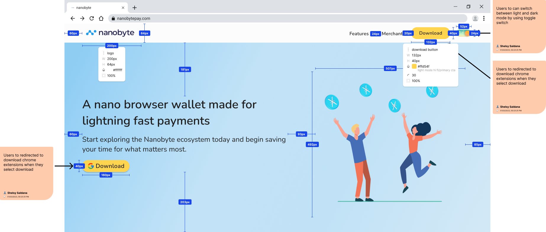
We handed off redlined screens with spacing, sizes, and color tokens for every element, plus notes on behavior: Download opens the Chrome Web Store listing, and the toggle in the nav switches between light and dark mode.
The launched site
Live on nanobytepay.com in July 2023.
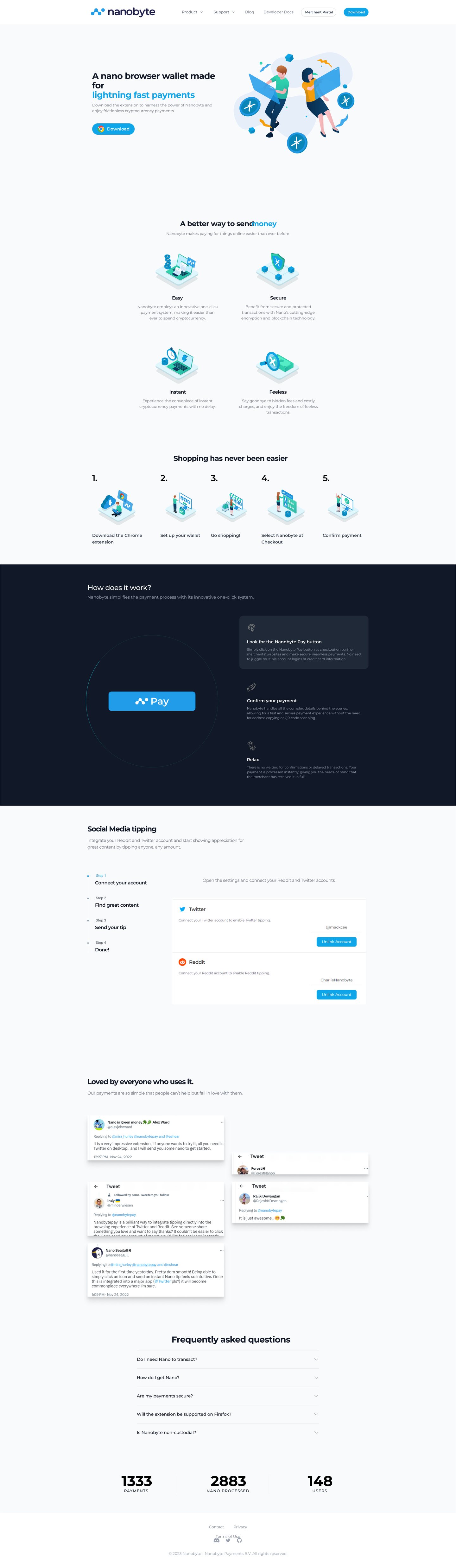
The launched site kept the structure we designed: “A better way to send money,” the five-step “Shopping has never been easier” strip, a How It Works section, a dedicated social media tipping section for Twitter and Reddit, testimonials, and the FAQ. Developer docs and the Merchant Portal now sit in the main navigation, closing the merchant gap from the brief.
Where it landed
Nanobyte launched the new site in July 2023. At the time of capture it reported 1,333 payments, 2,883 Nano processed, and 148 users.
Nanobyte taught me that on a product people are wary of, the website's real job is building trust. The decisions that mattered most weren't visual: more ways to download, plain explanations of security and privacy, and treating optional features as optional.