
Your own media library should feel as good on the TV as anything you pay a subscription for. Playfyn makes that true.
- Role
- Owner and Product Designer
- Timeline
- March 2026 - Current
- Platform
- tvOS / Apple TV
- Status
- Coming soon to the App Store
Built with
- Swift
- Xcode
- Claude Code
- Git
- GitHub
- VS Code
- Terminal
- Netlify
How it started
A self-hosting rabbit hole, a gap on Apple TV, and a notebook full of plans.
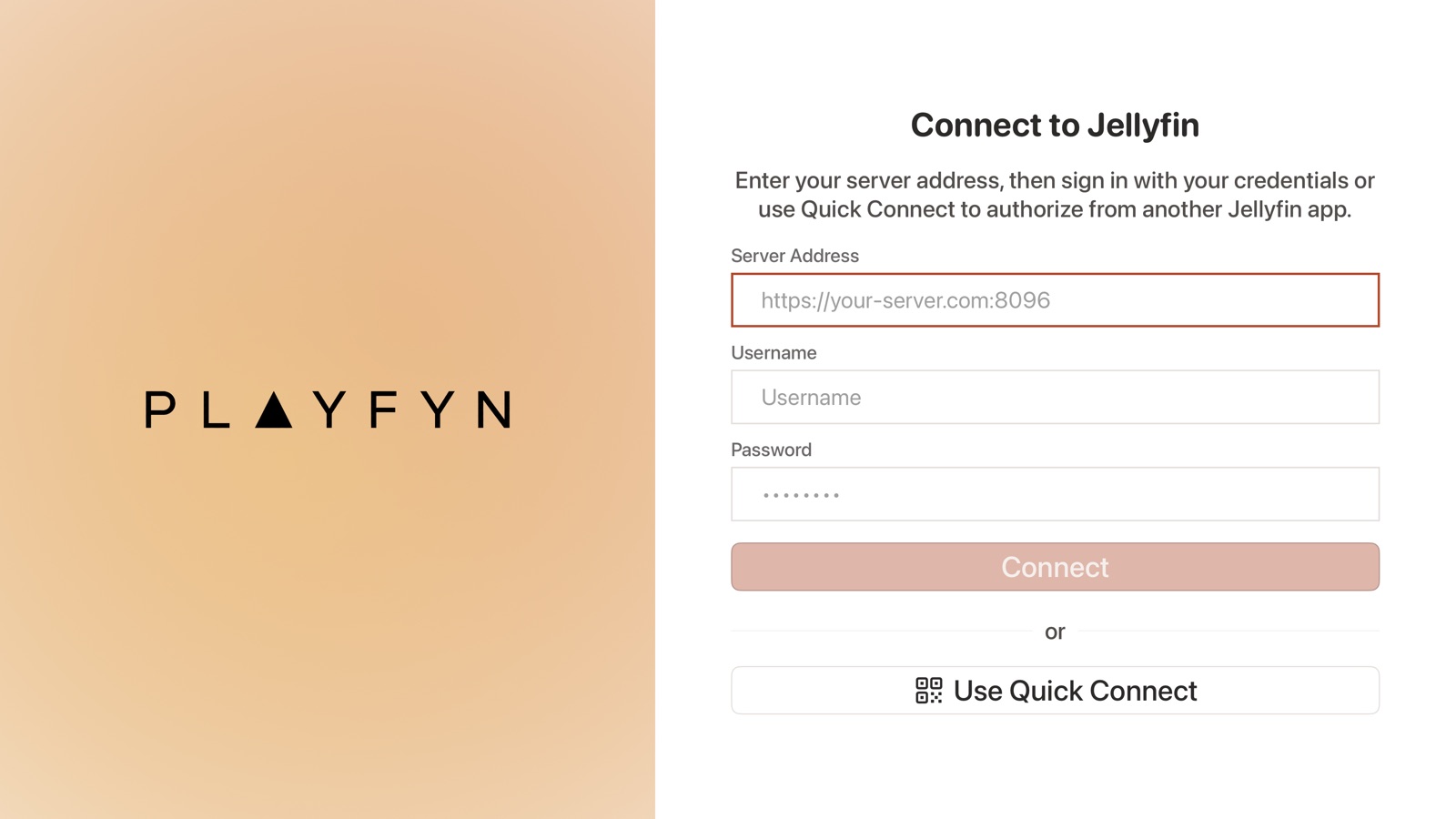
Playfyn started with a self-hosting rabbit hole. With streaming services raising prices year after year — and a physical media collection I actually wanted to keep — I went looking for a way to host my own content on a platform I controlled, and to replace a few of the subscriptions I was paying for. That search led me to Jellyfin, an open-source media server for streaming your own movies, shows, and music.
Most people run Jellyfin on a computer, but for me nothing beats the biggest screen in the house. There's no official Jellyfin app for Apple TV, and as a product designer I couldn't unsee the UX problems in the third-party options: frustrating logins, apps with unexplained “modes,” clumsy paths to the things you use most, little visual ambition, and inconsistent, careless details. The experience I wanted simply didn't exist.
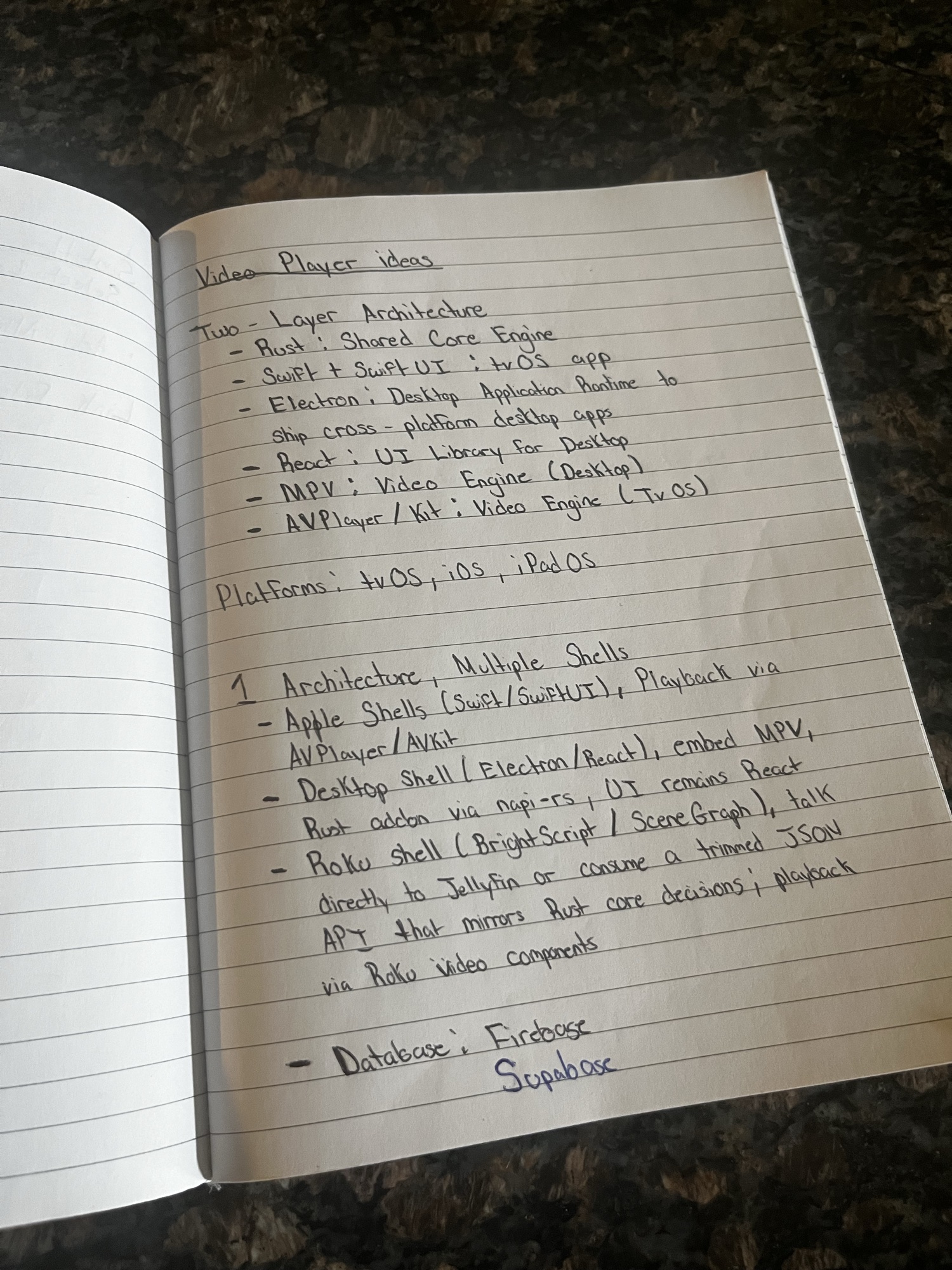
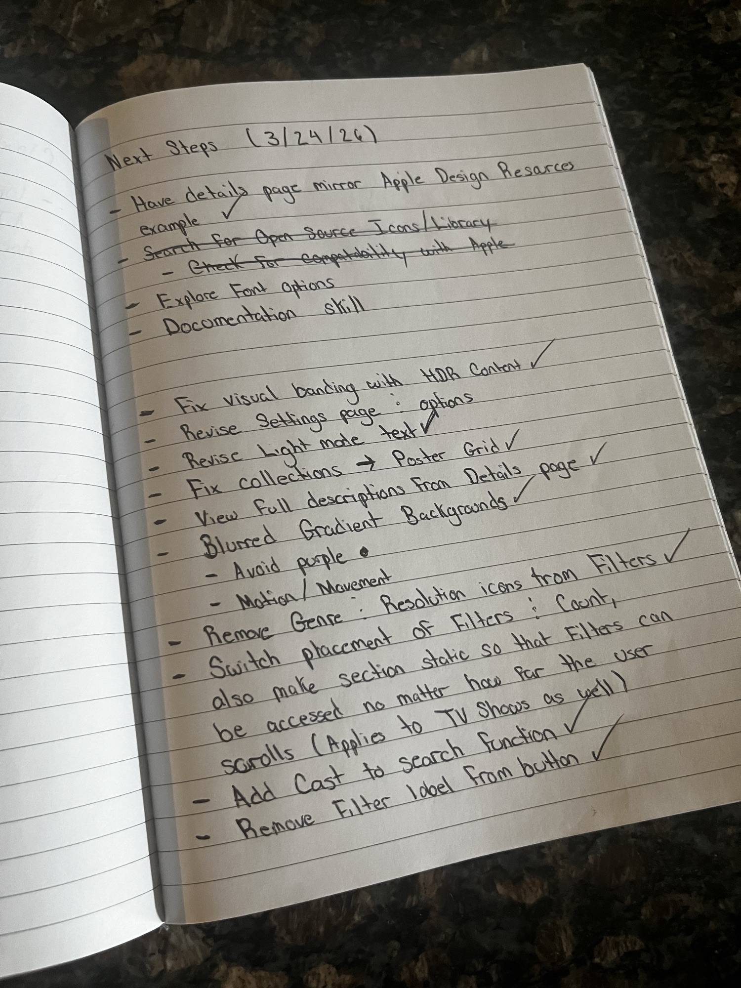
So I set out to build it. I used AI to pressure-test the idea — chatting with Copilot to explore approaches and gauge what was feasible — while filling a notebook with architecture sketches, feature lists, and a running set of “next steps” (a few pages are below). After a few weeks of planning, I turned those notes into a Product Requirements Document and handed it to Claude Code to build the first version.
The first output
One prompt doesn't ship a finished app — it hands you a rough first draft.
Despite how AI tools are marketed, you don't describe an app, get something polished, and deploy it over a weekend. The first build gave me working infrastructure and a little functionality — but no real sense of design. As the screens below show, nearly every page needed correcting.
So I worked the problem methodically: review each page, test how everything actually behaves, document every issue I found, then fix them with Claude Code one step at a time — the same loop, over and over, until the rough edges were gone.
One screen, read closely
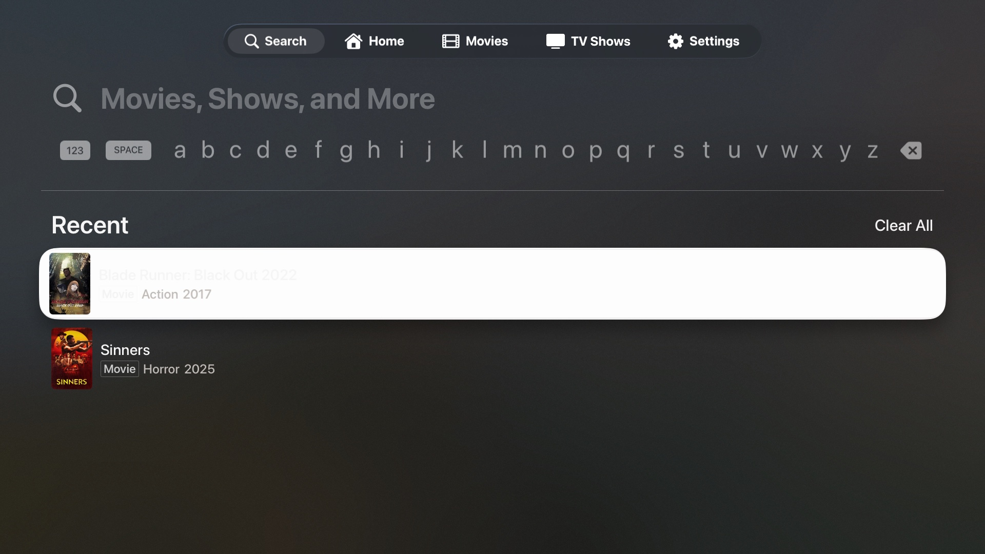
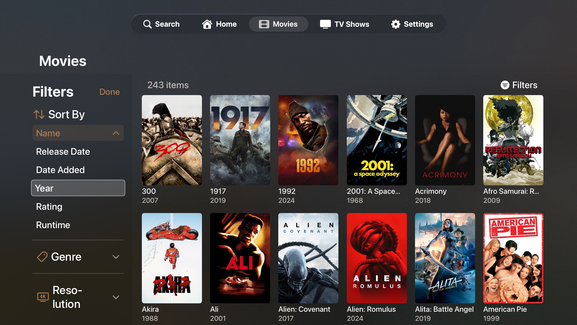
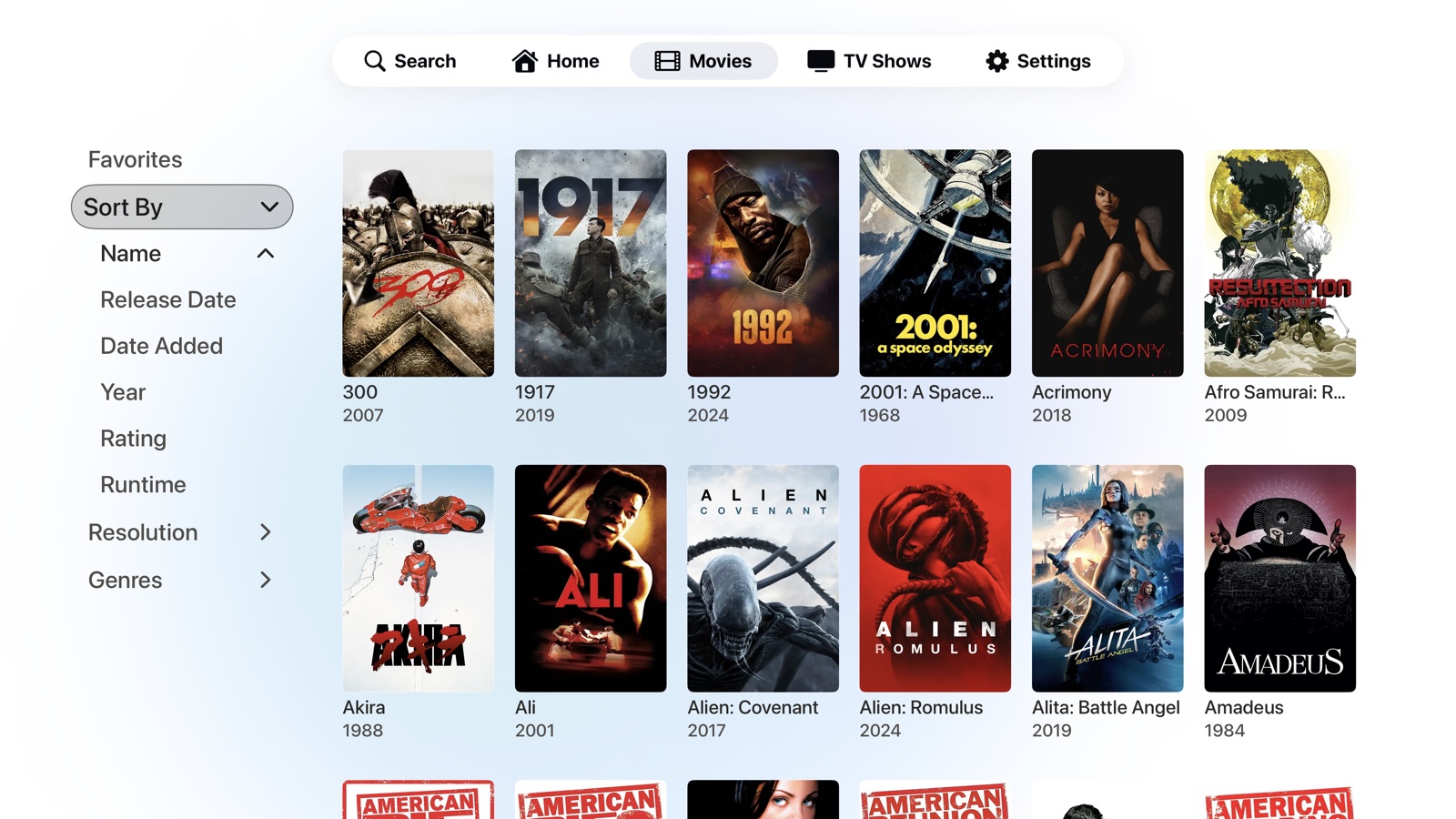
Take the original movies grid. One of the very problems I'd set out to fix in other clients — a clumsy path to the thing you use most — had quietly reappeared in my own first build. The filters were the clearest example, and worth reading closely.
Filters you had to chase
Browsing a large library leans on the filters — genre, year, resolution. But they only lived at the very top of the grid. Scroll a few rows in, decide to narrow by genre, and you'd have to climb all the way back up to reach them, then find your place again — and it got worse the deeper your library went.
The pattern everyone copies
It isn't only my first build. The most popular Jellyfin client on Apple TV hides its filters behind a button that toggles a panel open and shut, anchored at the top of the screen. The further you've scrolled, the more work it takes to do the one thing browsing is built around.
A panel that's always there
My fix was to delete the button entirely. Instead of a panel you summon and dismiss, the filters live in a permanent rail down the side of the grid — visible and reachable from any scroll position. Filtering stops being a round trip and becomes a glance, wherever you are on the page.
This was just one of dozens of issues like it — the same rough edges I kept running into across every other Jellyfin client, screen after screen.
Seeing them so consistently, and trusting my experience as a product designer, I became convinced these problems weren't unsolvable — only unsolved. With capable, accessible tools finally within reach, I could stop wishing the right app existed and build it myself, with one goal above the rest: the best possible experience for the person watching.
Design system & brand
A token-driven system in light and dark — and a wordmark instead of another play button.
Once the rough edges were gone, I pulled the visual language into a proper design system instead of a pile of one-off styles. Every screen resolves from one set of named tokens — background, surface, text, border, and an adaptive accent — defined once for light and once for dark, so a single change updates the whole app and nothing drifts out of step.
It's also where the warm direction was settled. I audited the original colors, scored their contrast, and swapped the default interactive blue for a terracotta accent in light mode. The one snag — white text on terracotta was hard to read — drove a deliberate contrast pass to keep the accent legible from across the room, the same groundwork the accessibility work builds on.
Core palette — Light mode
A wordmark, not a play button
Nearly every alternative player reaches for the same logo: some version of a play triangle. They're fine, but they're interchangeable — line their app icons up and you couldn't tell them apart.
Playfyn goes the other way with a custom wordmark, and hides the play symbol in plain sight: the “A” in PLAYFYN is the triangle. One mark that reads as a name and a play button at once — distinctive, ownable, and unmistakably its own.

How the work actually happened
Iteration wasn't polishing screens — it was learning the app well enough to make the right call.
The hard part was never visual taste. It was that real problems don't dissolve under a better prompt. To fix most of what was broken, I had to understand the app at a fundamental, technical level — how playback, focus, and state actually work — so I could weigh the options and make an informed decision instead of guessing.
So I built a loop and a toolkit around it. Each problem went through the same arc: reproduce it, understand why it happened, explore a few approaches, change one thing, verify it, and commit — over and over, until the rough edge was gone. The three problems below show what that looked like in practice. None of them were solved in a single step.
Xcode
Build, run, and watch it behave. Running every change on the tvOS simulator was the only honest way to see focus, playback, and layout problems the way a viewer on the couch would.
Terminal
Search, build, and trace. Following a single setting or a video stream from the on-screen control all the way down to the code that should act on it — and confirming a fix compiled for the real target.
Git & GitHub
Review every change, keep a way back. Version control let me read exactly what each fix touched, track progress across stages, and roll back cleanly when an idea turned out to be a dead end.
Claude Code skills
Investigate and verify, not just generate. An automated code-review pass and focused sub-agents to sweep the codebase and pressure-test a change before it shipped.
Three problems no single prompt could solve.
The 4K HDR that wasn't
The instinct to make something “safe for everyone” had quietly made it worse for everyone. The fix was to understand the edge case precisely enough to handle only it — which meant learning the technology, not rewording a prompt.
Playback was the headline feature, yet HDR was quietly broken: a pristine 4K HDR master came out downscaled to 1080p with its HDR stripped away. The app even carried a second, more capable video engine for exactly these files — but the code decided which engine to use and then ignored its own decision, always falling back to the same limited path.
I couldn't fix what I didn't understand, so I traced the whole playback pipeline in Terminal and Xcode — from the play button down to the request the app sends the server. The cause was a chain of well-meaning safety nets: the app forced the server to re-encode every file (to dodge a rare bug where one plays sound over a black screen) and capped requests at 1080p. Together they guaranteed a downgrade. I had to learn the real concepts — direct play versus transcoding, HDR and Dolby Vision metadata, why converting a stream destroys it — to see that the “safe” default was the actual problem.
I flipped the default to direct play — send compliant 4K HDR to the Apple TV untouched — and lifted the resolution and bitrate caps that were forcing the re-encode. To still cover the rare broken file, I added a watchdog: it watches the first few seconds, and if sound is playing with no picture, it silently re-requests just that one file as a converted stream. Good files now play at full fidelity; broken ones recover on their own. I verified the build for the real tvOS target, then tested on actual movies — the HDR difference was immediately visible.
Switches that did nothing
A setting that exists but does nothing is worse than no setting — it teaches people the app is broken. An honest, smaller Settings screen beats an impressive one that can't tell the truth.
The Settings screen looked finished, but much of it was theatre. Auditing every control, I found that more than half of the app's forty settings did nothing at all — toggles and pickers drawn on screen but never connected to anything that changed how the app behaved.
I ran a systematic sweep instead of fixing things at random. A setting has to exist in three places to truly work: the stored value, the on-screen control, and — the part that kept going missing — the code that reads that value and acts on it. Using Claude Code to help trace each one through the source, I tagged every setting as working, half-built, or dead, and tallied the damage by category.
Then a simple rule: complete it or remove it — never ship a control that lies. I wired up the high-impact settings in two focused waves (streaming quality, continuous play, hide-spoilers, localized metadata, buffering, the Dolby toggles, gesture controls) and deleted thirteen genuinely dead ones rather than leaving them as future promises.
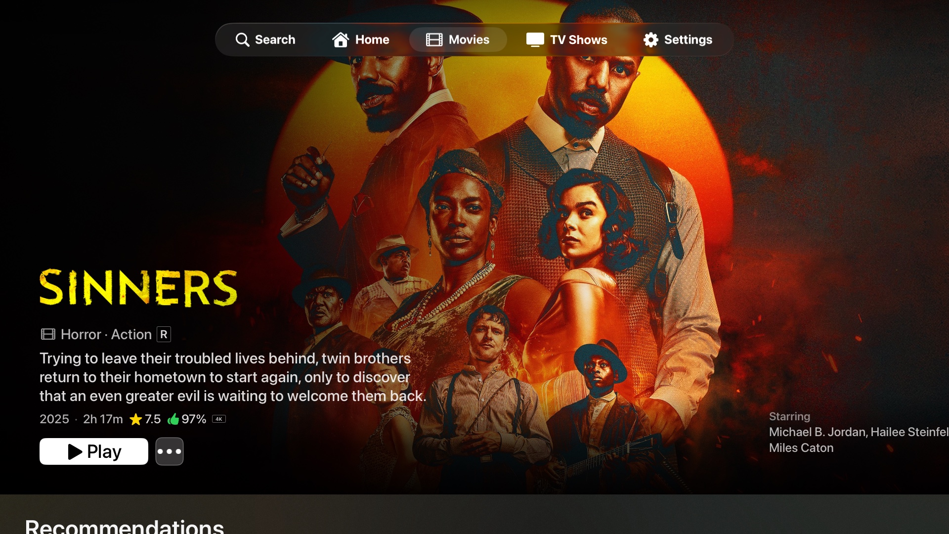
A hero that fought the focus engine
Designing for a ten-foot screen isn't a scaled-up phone layout. The focus engine has its own rules, and the most elegant-looking effect is worthless if someone with a remote can't move through it. Some of the best iteration is discovering which idea to abandon.
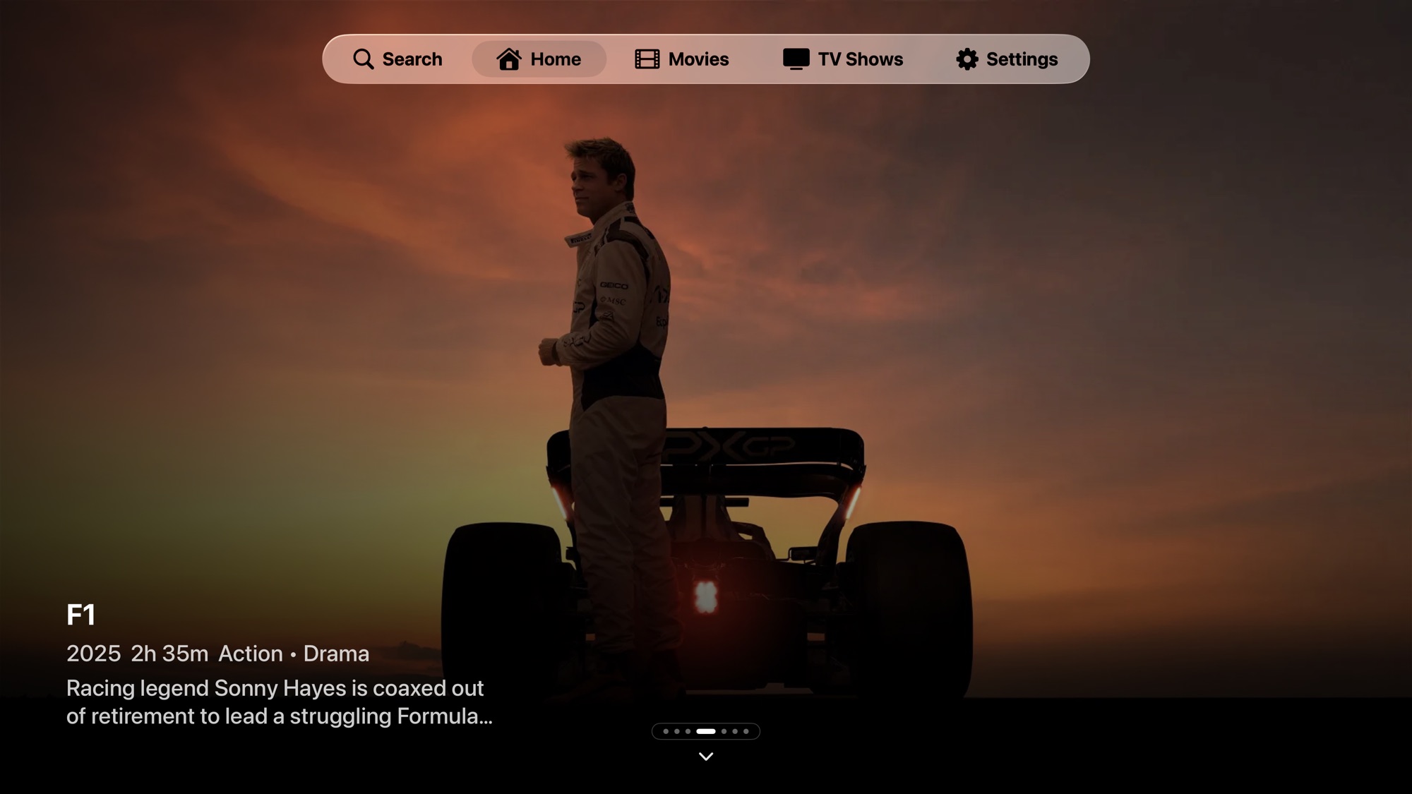
The home screen opened on a modest banner that felt secondary. I wanted a full-bleed featured hero with the authority of the App Store's front page — big artwork filling the screen, the next row just peeking below to invite a scroll.
Making it big was easy; making it behave was not. My most ambitious version pinned the hero in place while the rows slid over it — and it broke navigation entirely. That forced me to learn how tvOS actually moves focus: it reasons about where things sit in the layout, not where they appear on screen, so the visual trick I'd used left the remote unable to find the hero again. I iterated in the simulator, comparing against captures of the App Store to get the proportions right.
I rebuilt it honestly: the artwork lives in a full-screen background layer that reaches behind the translucent tab bar, while the content and navigation stay within the bounds the focus engine trusts. I tracked the scroll position by hand so the image drifts with the content for a parallax feel, clamped it so it never over-scrolls into empty space, and snapped focus cleanly back to the top. The result looks effortless — which is what took the most work.
What building Playfyn taught me
Building a product is a process — and it changed how I work.
The biggest lesson is that building a product is a process, not an event. The promise that you describe an app and get it back over a weekend isn't how real software happens. Playfyn took months of the same loop — find a problem, understand it, try something, verify it, and move on — and the work reached well past the app itself: a design system, a brand and wordmark, localization, a marketing site, a launch teaser, and the groundwork for the App Store.
It also taught me that I can't design what I don't understand. To fix playback I had to learn how video actually reaches the screen; to fix the home screen I had to learn how the focus engine really thinks; to fix the settings I had to trace state through the entire app. Picking up Xcode, the terminal, and version control — and learning the technical details underneath each problem — is what let me make informed decisions instead of guessing at them.
What I'm left with is a more fundamental understanding of how a product comes together at every stage, from a notebook sketch to a shipped build. I'm a stronger designer for having lived in the whole stack rather than just the screens, and for treating every rough edge as something to understand rather than something to hand off.
Where it stands
Playfyn is finished as version 1.0 and coming soon to the App Store: Quick Connect sign-in, a warm adaptive theme, deep appearance and playback controls, search across titles and cast, skip intro and credits, six-language localization, and direct-play 4K HDR that leaves the source untouched. It ships with a marketing site and a launch teaser to match.