Client case study · Hi-fi prototype and style guide delivered
Amplify for the Islamic Family & Social Services Association
Shopping in your own neighborhood shouldn't depend on reading the app. Amplify was redesigned so it doesn't.
- Client
- Islamic Family & Social Services Association (IFSSA)
- Role
- UX/UI Designer, on a team of designers
- Timeline
- Oct 2022
- Platform
- Mobile app (iOS)
At a glance
The problem, the key calls, and where it landed.
- The problem
- The Islamic Family & Social Services Association (IFSSA) commissioned Amplify, a shopping app for neighborhood businesses: people browse local shops and their deals, then pay in the app with Local Dollars. The app it replaced was a text-heavy utility: a QR code, a hamburger menu, and plain lists of business names. For one of its core audiences, newcomers who may not read English at all, almost every task depended on reading.
- Team
- A team of UX/UI designers on an Avocademy client project for IFSSA. I worked across persona and flow work, wireframes, high-fidelity UI, and the style guide.
Key decisions
Result
A high-fidelity prototype, annotated screens, and an eight-part style guide handed to IFSSA in November 2022.
Where it started
A working app that assumed everyone reads English.
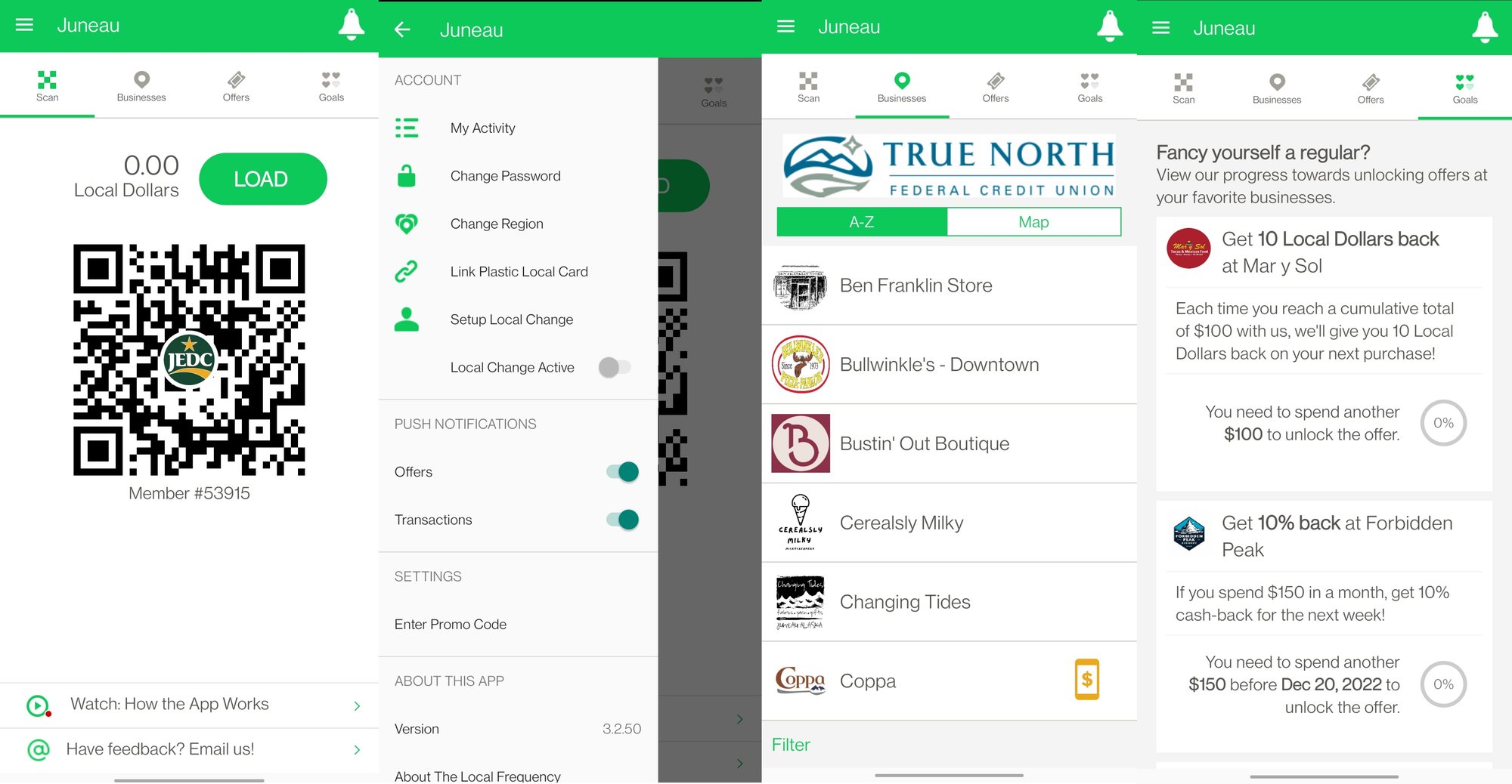
The existing app covered the essentials: a Local Dollars balance, a QR code to pay with, a list of participating businesses, and a Goals tab for rewards. But every piece of it was text.
The directory was a list of names and logos with no way to tell what a place sells, how far away it is, or whether it's accessible. Rewards were paragraphs of conditions (“each time you reach a cumulative total of $100…”). Account settings sat behind a hamburger menu. That's fine for a confident English reader, and a wall for anyone else.
Who we designed for
Two people at opposite ends of the same app.
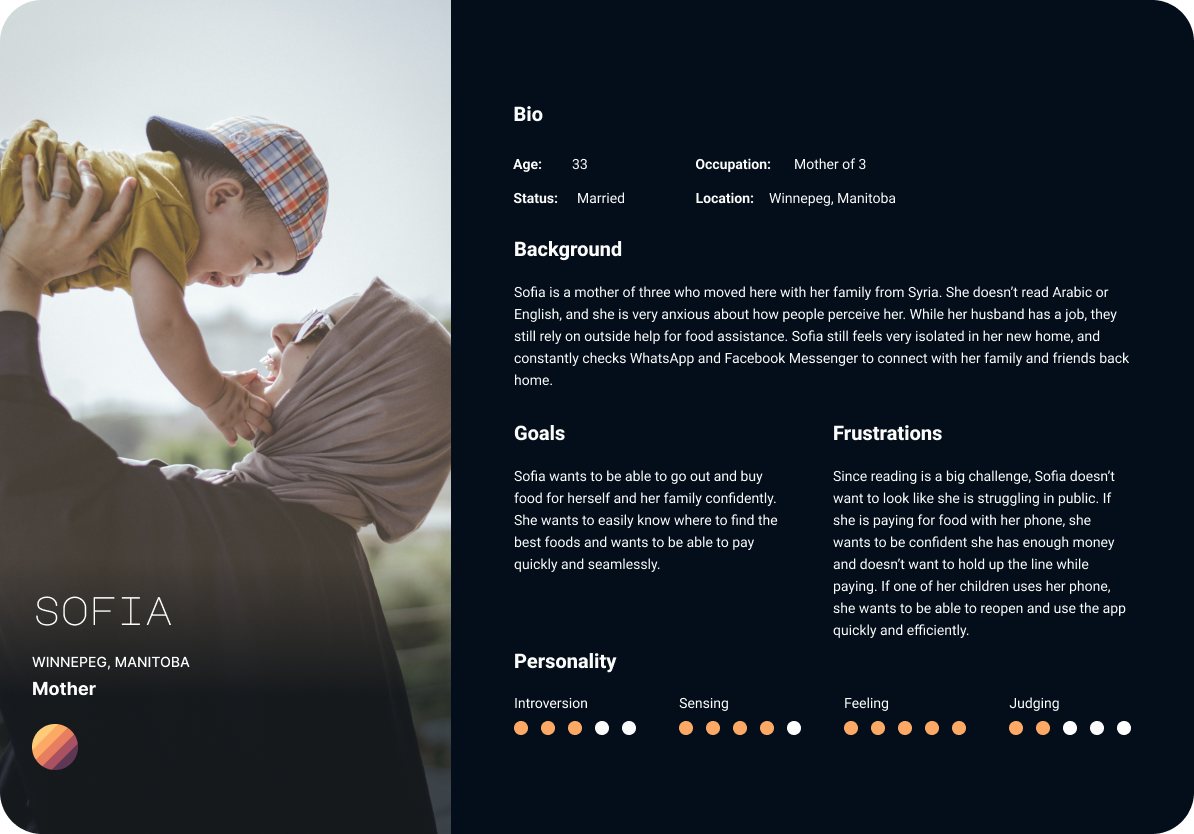
Sofia, 33, moved to Winnipeg from Syria with her husband and three children. She doesn't read Arabic or English, the family relies partly on food assistance, and she worries about how people see her. She wants to buy food confidently, know she has enough money before she pays, and never hold up the line. Her kids sometimes use her phone, so she needs to get back into the app quickly.
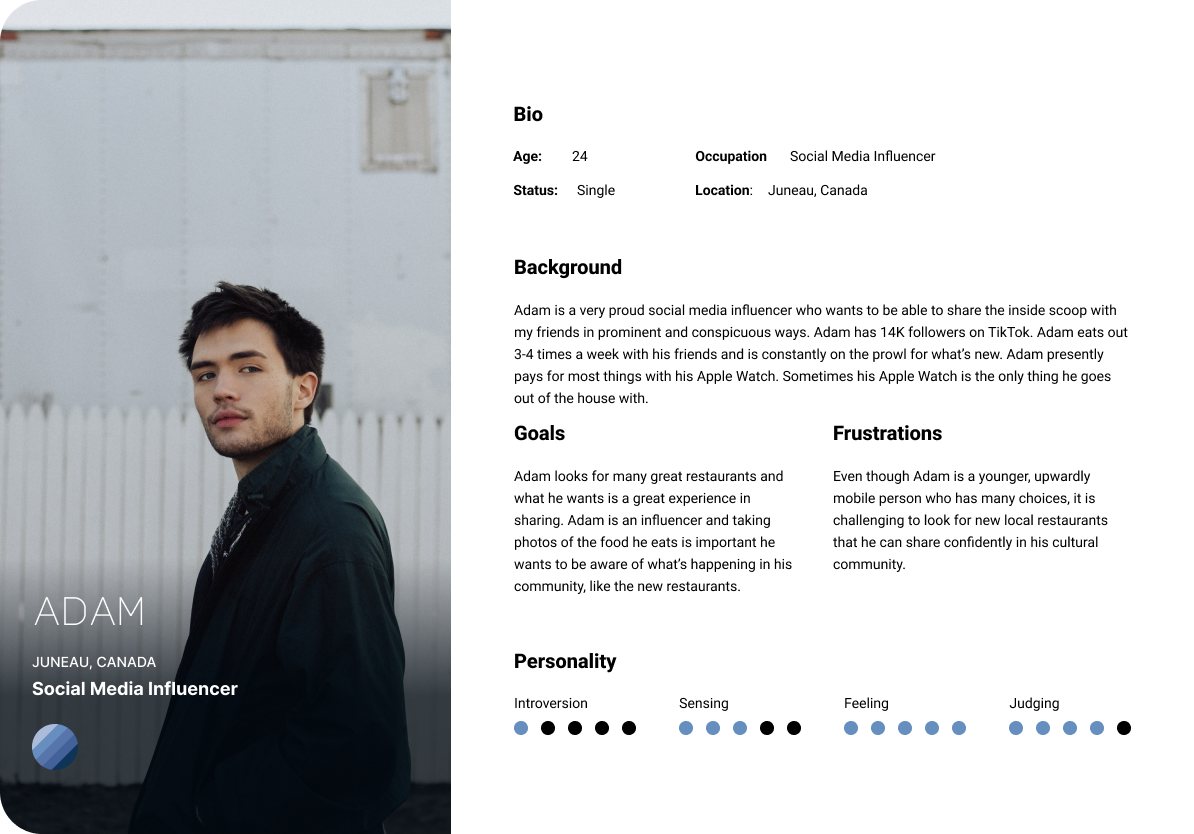
Adam, 24, is a social media influencer with 14K followers on TikTok. He eats out three or four times a week, often with only his Apple Watch, and he's always looking for the next new place to share with his community.
Together they set the brief: the app had to work without reading, and it had to be worth talking about.
Show, don't tell
Wherever a screen leaned on a sentence, we looked for a photo, an icon, a number, or a video that could carry the meaning instead.
Know before you pay
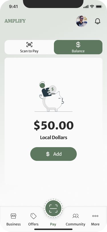
The balance should be visible before checkout, in large numerals, so nobody finds out at the counter that they're short.
Worth sharing
Deals, purchases, and gifts should all be one tap from being shared, because word of mouth is how local businesses grow.
Mapping the core flows
Three journeys, from loading money to sharing a find.
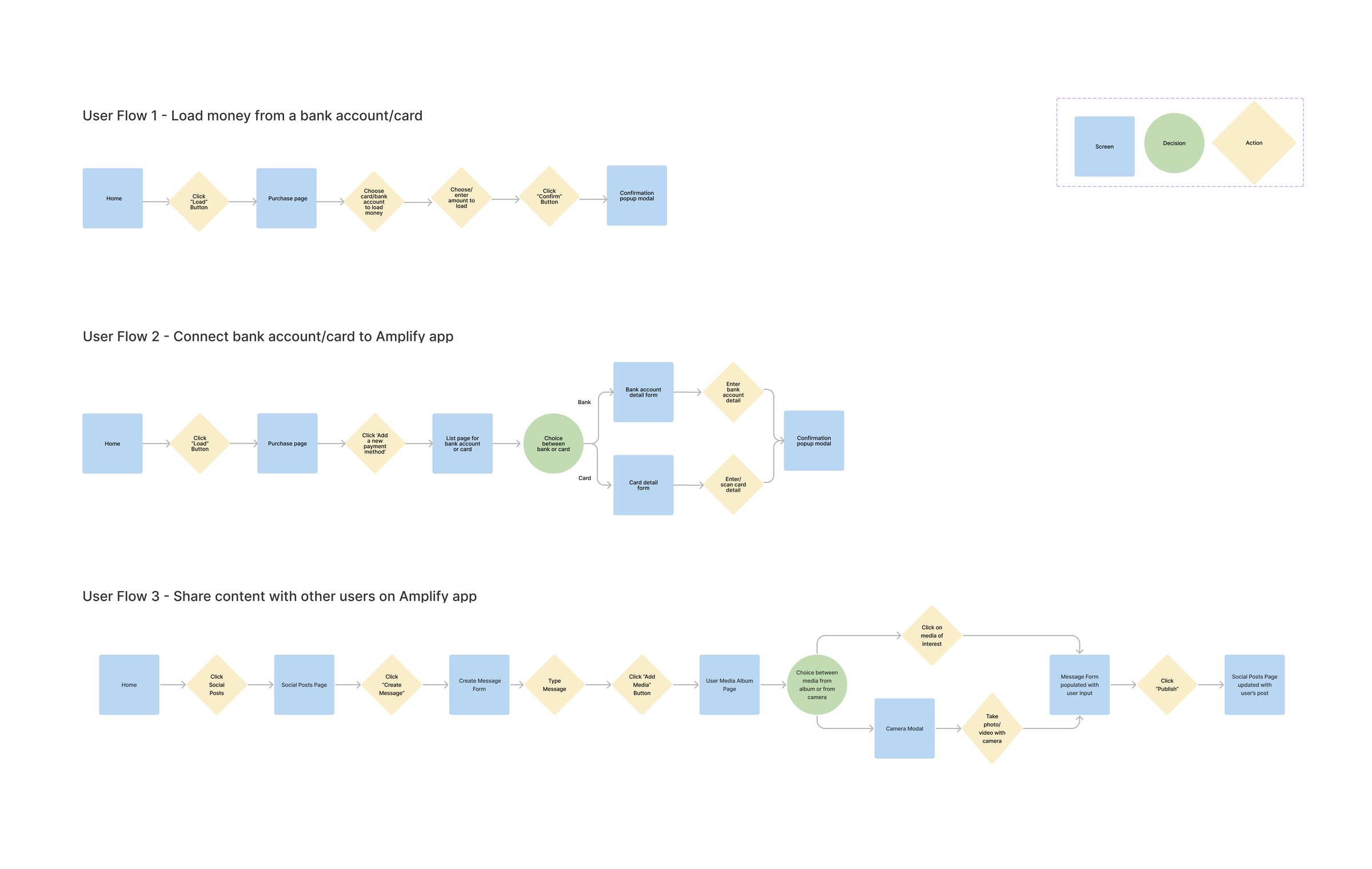
We mapped the three flows the app depends on: loading money from a bank account or card, connecting a new bank account or card (the one place the path branches), and sharing content with other people.
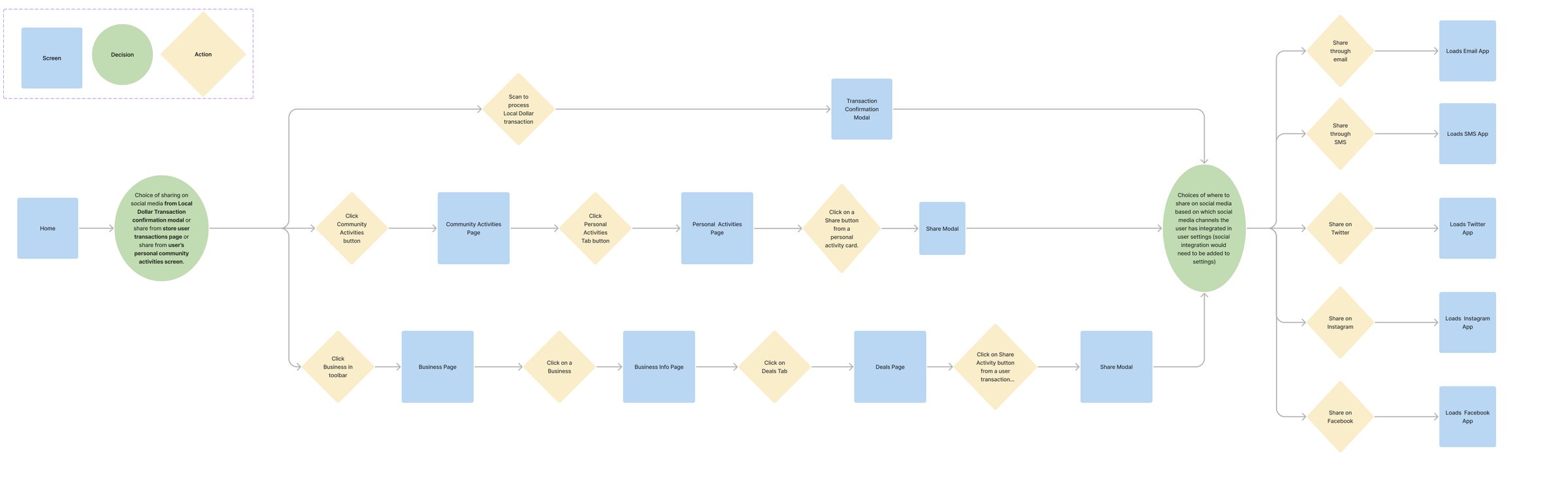
Sharing changed the most after review. The first version only shared from a social posts page. The revision lets you share from three places people actually are: a payment confirmation, your own activity, or a business's deals. All three end at one share sheet that only lists the channels you've connected.
Getting in without reading
A phone number, a magic link, a phone call, and a welcome you can watch.
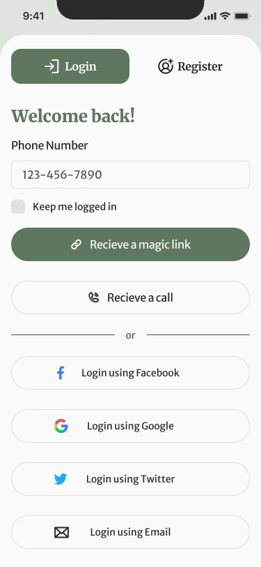
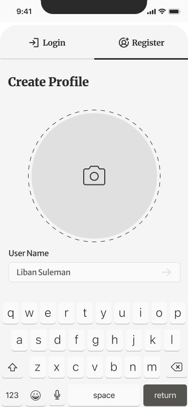
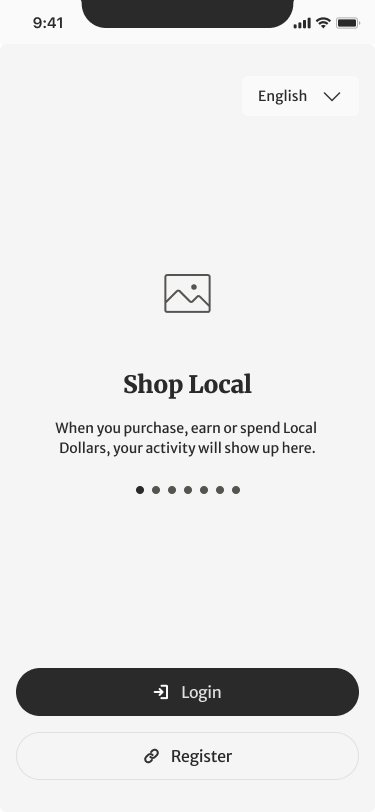
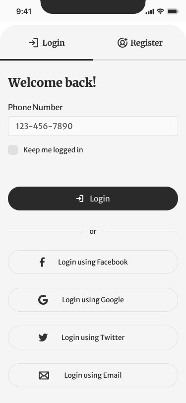
Passwords and email forms are the first wall for someone who can't read the interface. So sign-in starts with a phone number, something everyone already knows, and replaces the password with a magic link or an automated call. Facebook, Google, Twitter, and email are there for everyone else.
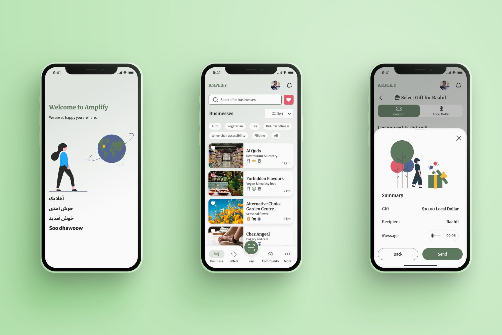
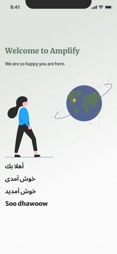
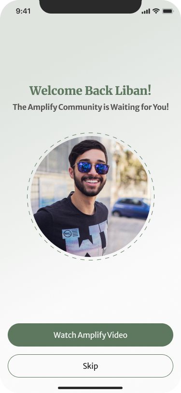
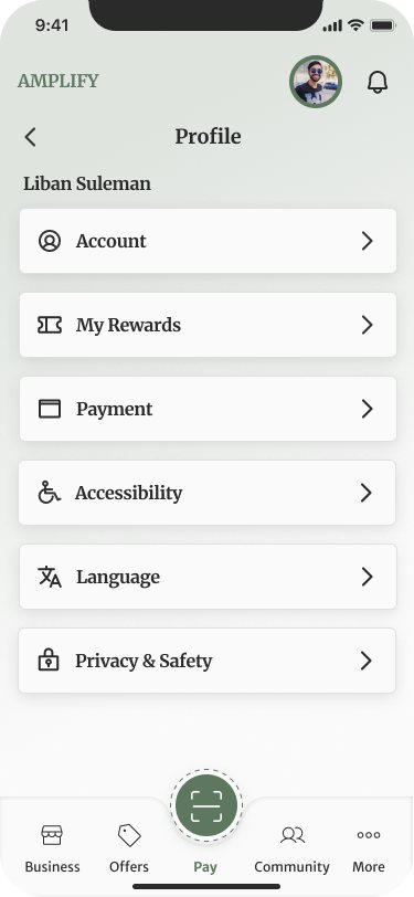
The welcome screen greets you in Arabic, Persian, and Somali as well as English, and the onboarding is a short video rather than a tour of text screens. Returning users are greeted with their own photo, so it's obvious at a glance whose account is open, which matters when a child has been using the phone. From there, Accessibility and Language sit in the profile menu alongside Account and Payment, not buried in a settings screen.

Browsing that doesn't need words
Photos, icons, and tags do the reading.
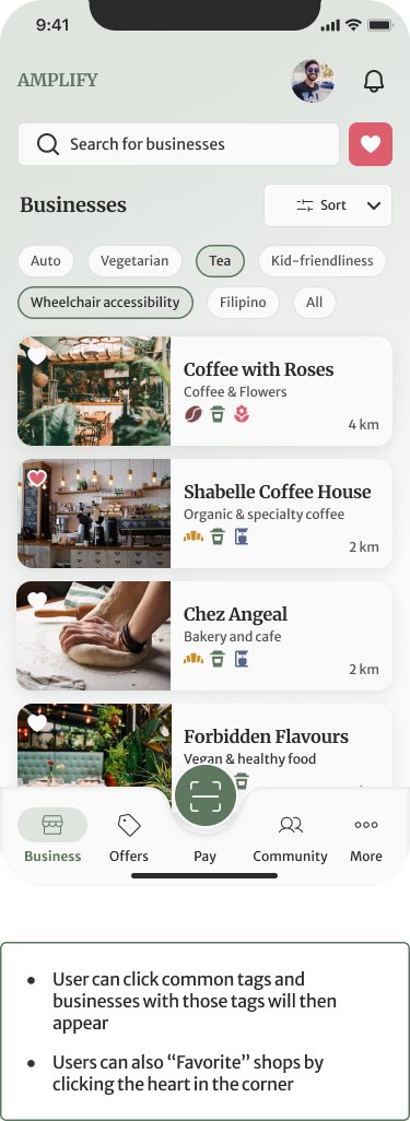
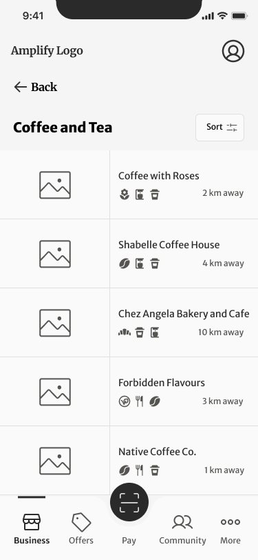
Every business card leads with a photo of the place, then its name, a category, a row of amenity icons, and the distance. Tags across the top (Vegetarian, Tea, Kid-friendliness, Wheelchair accessibility, Filipino) filter the list in one tap, and a heart saves favorites.
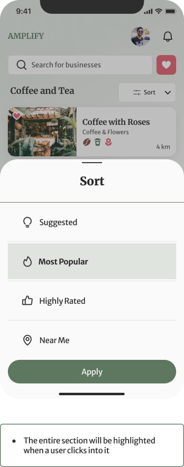
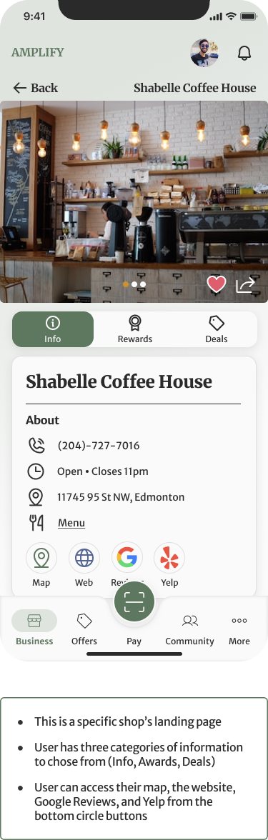
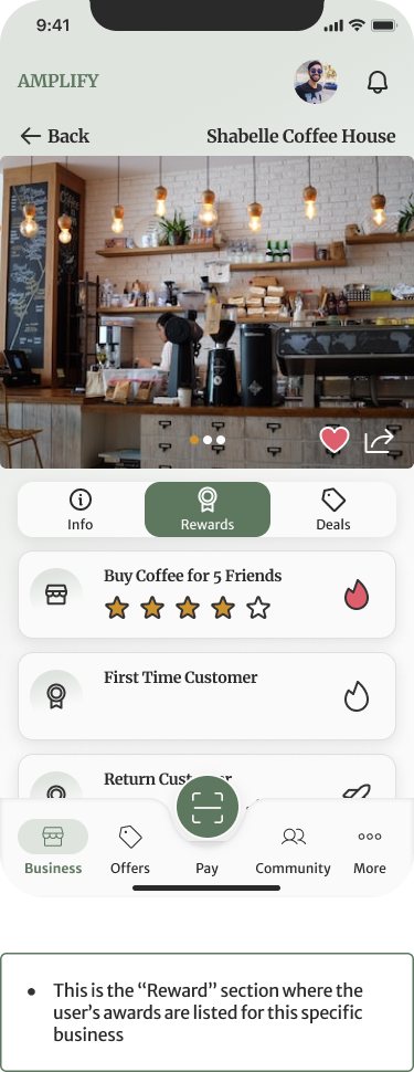
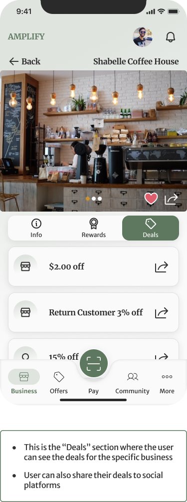
Sort opens as a sheet from the bottom with four options. The whole row highlights when you choose one, so the target is the full width of the screen, not a small radio button. Each business page splits into Info, Rewards, and Deals, with one-tap circles for the map, website, Google reviews, and Yelp. Rewards show progress as stars instead of the old paragraphs of conditions.
Pay is always one tap away
The scan button sits at the center of every screen.
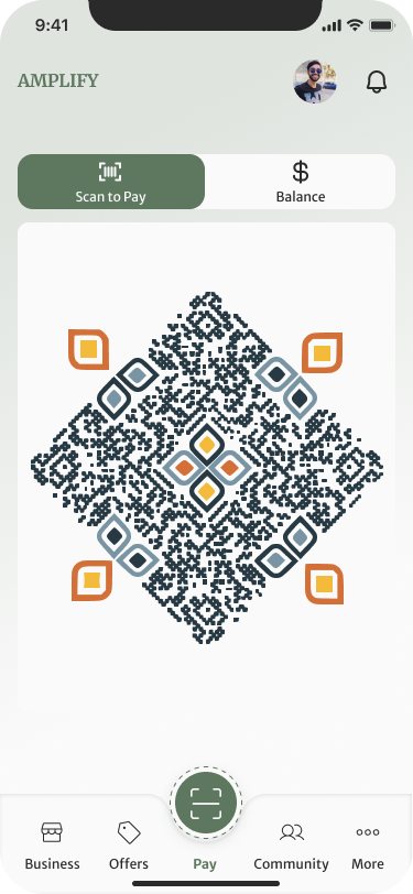
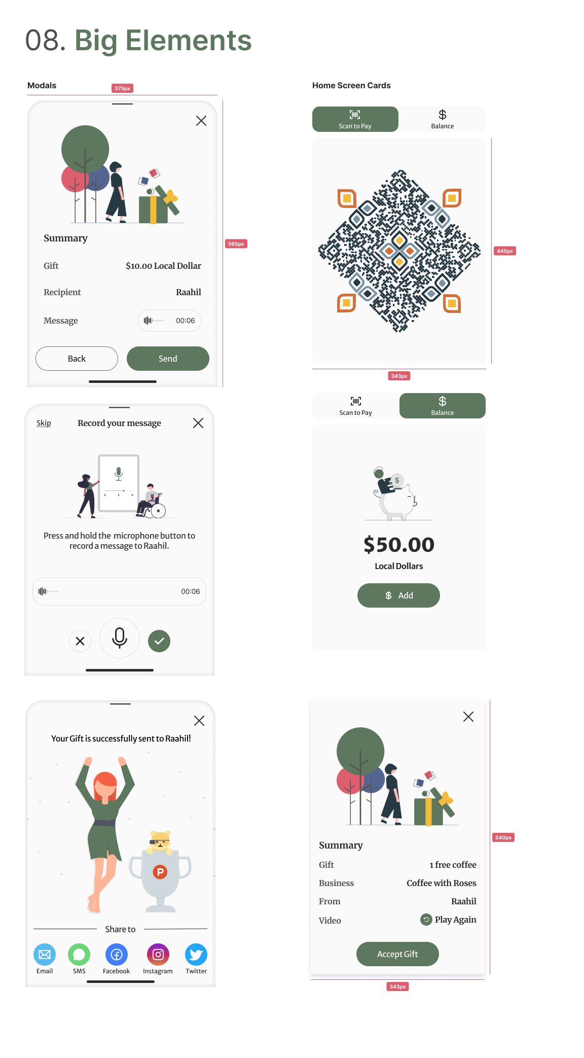
In the old app, paying meant first finding the QR code. In Amplify, a raised Scan to Pay button sits in the middle of the tab bar on every screen. It opens a two-way toggle: Scan to Pay shows your code, and Balance shows your Local Dollars in large numerals with an Add button. Sofia's “do I have enough?” is answered before she reaches the counter.
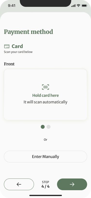
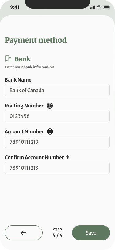
Adding money follows the mapped flow. Choose a card or a bank. A card scans with the camera (“hold card here, it will scan automatically”), with typing it in as the fallback. Bank details are split into numbered steps.
Gifts with a voice
A recorded message says what a typed one can't.
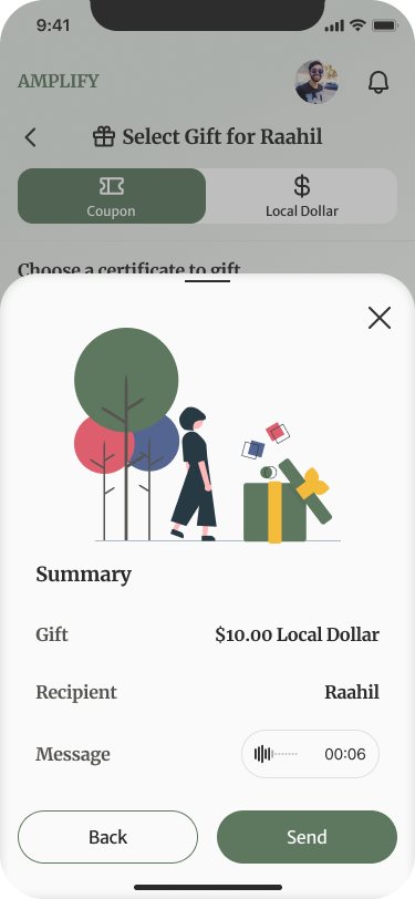
Gifting is where the two personas meet. You pick a coupon, like a free coffee, or an amount of Local Dollars, and attach a voice message instead of typing one, so neither sender nor recipient has to read or write.
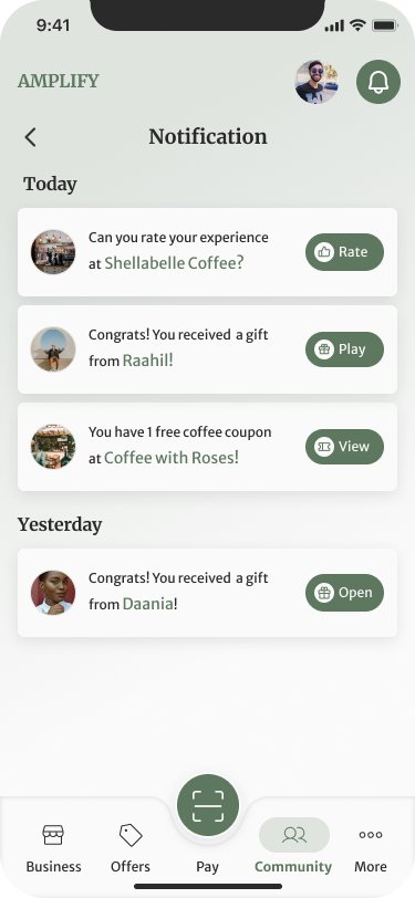
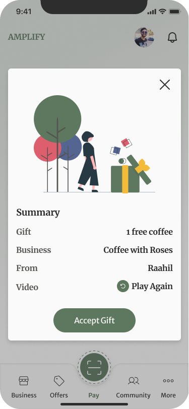
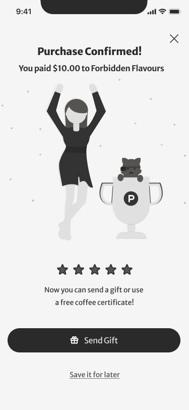
The recipient gets a notification and opens a summary of the gift, the business, who sent it, and a Play Again button for the message, then accepts it. After a purchase, the confirmation offers to send a gift or share the moment to email, SMS, Facebook, Instagram, or Twitter.
From wireframe to UI
Three rounds of exploration before the high-fidelity screens.
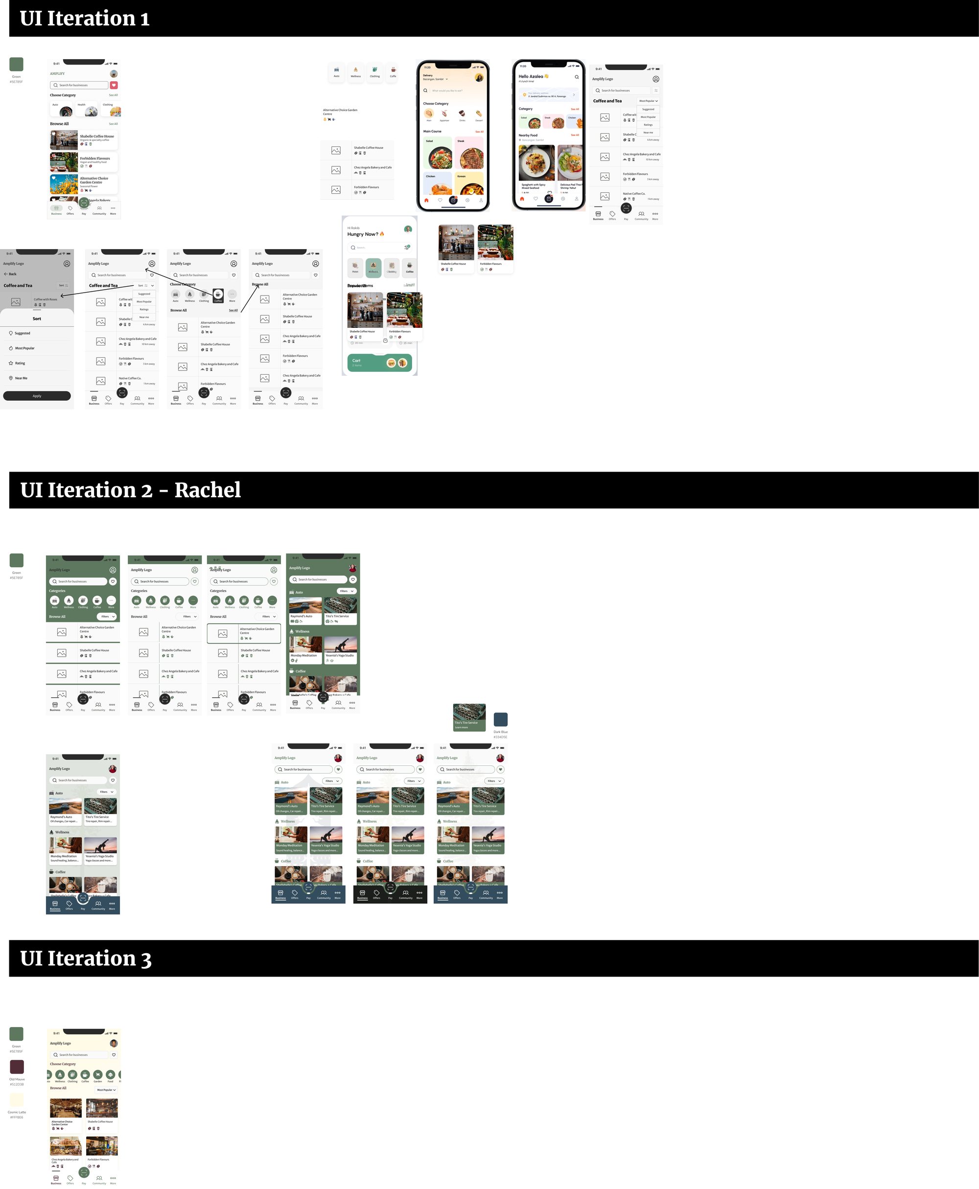
We worked out structure in grayscale first, then ran three rounds of UI exploration on the business directory: a list-first layout, a category-tile layout, and a card layout led by photography, each with its own take on color.
The final design kept the list's scannability, brought in photo-led cards, and settled on a calm sage green with a warm ochre accent.
Style guide
Eight sections, one calm palette.
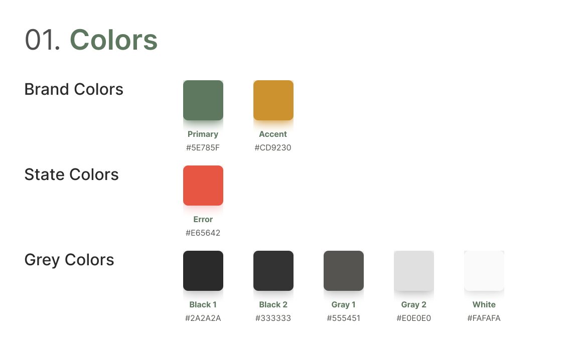
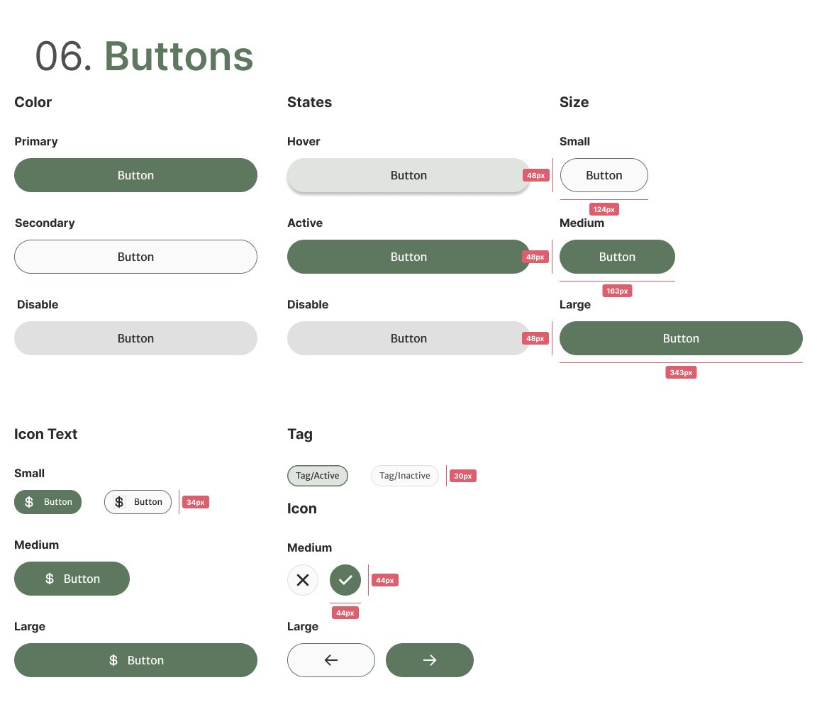
The style guide covers colors, typography, iconography, the grid, inputs and selectors, buttons, and small and large elements. The palette is a sage primary (#5E785F), an ochre accent (#CD9230), a red for errors, and five greys.
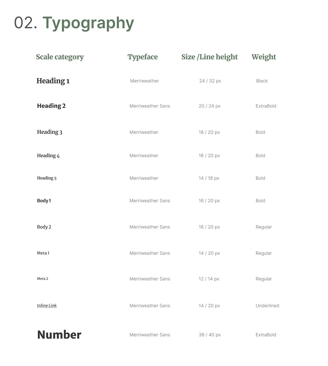
Headings are set in Merriweather, a warm serif for the brand's voice, with Merriweather Sans for body text so it stays legible at small sizes. Balances get their own large Number style. Layouts sit on a four-column grid with 20px margins and gutters, and every component is documented with its states and sizes.
Presenting to IFSSA
Walking IFSSA through the work, live.
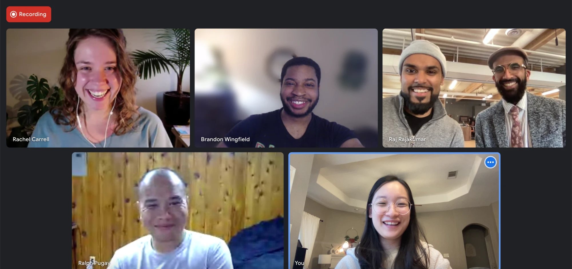
We closed the project with a live presentation to IFSSA over video, walking through the research, the prototype, and the style guide, and answering their questions as a team.
Where it landed
We handed IFSSA a high-fidelity prototype, annotated screens for every key flow, and the full style guide in November 2022.
The lesson I carry from Amplify is that designing for someone who can't read your interface makes it better for everyone. Photos, icons, big numbers, and voice took pressure off every user, including the ones who could read every word.